
Vitaliy Andervin
Data Order Market Exchange Trader
Fonts by «ParaType»
© Vitaliy Andervin, 2026
What lies behind candlestick charts: real trades and the logic of the participants. Price is viewed as a consequence of order flow, player structure, and the functioning of systemic capital. Instead of the abstract «volume has increased,» the reader learns to see scenes: absorption and icebergs, stop-losses and short-shorting, useless profits, «cosmetic» volume, spoofs, and DOM updates — and transform them into trading rules and scenarios for further action.
ISBN 978-5-0069-2258-7
Created with Ridero smart publishing system
Contents
Introduction
Trading is the ability to see cause-and-effect relationships where most people see only candles and indicators. If the first book introduced the language of basic market data (volume, delta, limit orders, heatmaps) and taught you to recognize the “footprints” of market participants, this book focuses on how those footprints are formed in real time inside the order book (DOM/LOB) and the time & sales tape (T&S), and how to make precise decisions based on this micro-mechanics.
We move to the matching process itself: from adding and canceling limit orders to queues, priorities, trade aggressors, tick-by-tick transitions, bursts and decay of aggression. You will learn to read context → trigger → confirmation → invalidation at the level of individual ticks and queues, combining the order book, the tape, and the chart into a single coherent scene.
Why the second book matters
— Understand the root causes of volume and delta signals: why “there was a lot of volume” and what exactly created it.
— See the participant behind the trade: aggressor vs. passive side, execution priority, the “signature” of a systemic player.
— Filter illusions: distinguish bait from real intent; recognize absorption, icebergs, spoofing and refresh.
— Bring order to micro-noise: uptick/downtick, bid-ask bounce, tick/time/volume aggregates and their filtering.
What you will learn
— Order Book (DOM/LOB): Bid/Ask structure, spread and mid, depth, “walls” and “ladders,” queues and their imbalances, microprice.
— Time & Sales (T&S): trade aggressor, tick classification, aggregated vs. single prints, size series, stop flows (sweep/exhaustion), bid/ask flip.
— Order-flow patterns: absorption and icebergs, spoof/refresh, “volume inflation,” “volume spread,” and the 50% equilibrium level.
— Practice & participants: indirect estimation of open interest, identifying the side and number of participants in aggregation, the “large-player signature,” and combining tick charts, tape, and DOM to verify hypotheses.
How to work with the book
— Start with the Glossary and Settings Guide: quickly configure DOM and T&S for the task — levels, columns, filters, multi-window layouts, chart aggregates.
— Then move through four chapters: from order book mechanics and ticks to patterns and practical participant recognition.
— Always follow three steps: context (what’s happening with queues/spread) → trigger (what exactly was the event) → confirmation/invalidation (what proves or disproves the hypothesis).
— Practice: tape replay, tick markup, calculation of simple metrics, mini checklists for trades and post-analysis.
Who this book is for
— Traders who want to move from an indicator-driven view to a behavioral one — reading queues and aggression.
— Those already using volume/delta/footprint tools and seeking to understand the root causes of signals.
— Algo and quant practitioners — as an operational description of microstructure and a source of testable rules.
Chapter 1 ● Order Book Mechanics
1.1 Quote Book (Bid/Ask), Spread, Mid Price, Tick Size
1.2 Order Queue and Execution Priorities
1.3 Market Depth and Liquidity Asymmetry; Walls and “Ladders” (Stacked Liquidity)
1.4 Queue Imbalance (L1–L10) and Microprice
Chapter 2 ● Time & Sales Tape. Tick Structure
2.1 Interface and Core Fields
2.2 Trade Side Identification
2.3 Aggregation. Single Trades. Metrics
2.4 Tape ↔ Chart: Tick-Based and Time-Based Representations
2.5 How to Read Limit Orders through the Tape
Chapter 3 ● Order Flow Patterns: Tape · Chart · DOM
3.1 How to Work with Order Flow Patterns
3.2 Absorption and Icebergs (Absorption, Iceberg / Refresh)
3.3 Stop Runs, Bursts, and Volume “Manufacturing”
3.4 Spoof / Refresh and Behavioral Traps
Chapter 4 ● Practice: Market Participants and Implied Open Interest
4.1 Indirect Estimation of Open Interest
4.2 Identifying Trade Side and Number of Participants
4.3 Systematic Participant and Market Maker
● Conclusion
● Book Three
Preface●
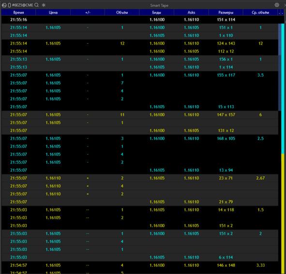
Print tape (T&S):
Definition A row-by-row stream of already executed trades.
Each row represents an execution fact (a match) between an aggressor and a resting limit order.
How to Read the Columns in the Screenshot
— Time — the moment of execution; dense “clusters” of rows indicate bursts or trade series.
— Price — the execution level.
— +/− — tick direction:
— + (uptick, hit on the Ask),
— — (downtick, hit on the Bid),
— — (no price change).
— Volume — trade size (or the summed size of aggregated small prints).
— Bids / Asks — best L1 quotes at the moment of the print (spread context).
— Sizes — visible depth at the best Bid × Ask at the time of execution (e.g., 151 × 114).
— Avg. Volume — average size within the package if the row is aggregated.
Aggregated / “Whole” Rows
— Gray or highlighted blocks with large numbers represent aggregation of prints close in time and price into a single package (volume is summed).
— This is a visual aggregation, not a guarantee of a single counterparty; it is used as a noise filter and for reading execution tempo.
— Series of “+” at the upper quote with a stable Ask → buyer-aggressor hitting the offer; watch whether the spread expands and whether the level holds (absorption / refresh).
— Series of “−” at the lower quote with a stable Bid → seller-aggressor.
— Large packages at one level after a key price is touched → likely a stop flow (sweep / exhaustion).
— Repeated identical sizes in a row → a possible “signature” of a systematic participant or algo.
Why the Tape Matters
The tape shows actual hits on liquidity: where, by which side, and at what pace.
It helps distinguish displayed density in the order book from real interest and capture moments of flips and stop releases.
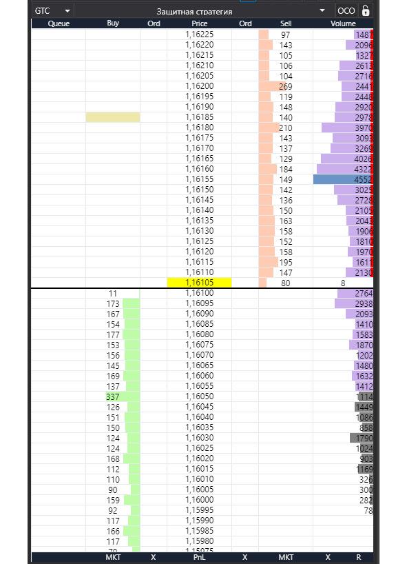
Order Book (DOM / LOB):
What it is.
Two queues of limit orders arranged along a price ladder: Ask (sell orders) on top and Bid (buy orders) below. Between them lies the price ladder itself.
How to Read It on the Screen
— Price — the price scale. The yellow band marks the current price / last print; asks are above it, bids are below.
— Sell / Buy (level volumes) — how many lots are resting as limit orders at each price level. Dense blocks = “walls.”
— Ord / Queue — the number of orders and/or your position in the queue at that level (if the platform provides it).
— Volume histogram on the right — cumulative traded volume by price (volume profile); do not confuse this with resting limit orders.
Key Concepts
— L1 (best quotes) — the top Ask and bottom Bid;
— L2…Ln — depth further away from the market.
— Depth — how many levels are visible / available. The cumulative depth on each side matters most.
— Spread — the difference between Best Ask and Best Bid.
— Narrowing = more liquidity at L1; widening = thin market or aggressive pressure.
— Mid — the midpoint between the best quotes:
— (Best Bid + Best Ask) / 2.
— Useful as a reference axis for pegged orders and balance assessment.
What to Watch First
— Depth asymmetry (significantly more liquidity on one side) → higher probability of price being pulled or a level being defended.
— Walls / “ladders” (repeating volume blocks step by step) → potential reaction zones.
— Pulls / Stacks (rapid cancellations / additions) on L1–L3 → fresh signals of changing intent.
— Interaction with the spread: hits on one side without spread expansion → a sign of aggressor absorption (absorption / refresh).
Trades and Orders
Basic Logic
A trade occurs when an aggressor (a market order or a triggered stop) matches with someone’s limit order in the book (DOM / LOB).
— DOM shows intentions (resting limit orders, depth, queue).
— T&S records execution facts (prints).
1) Market Order
What it does.
Executes immediately at the best available prices until the full size is filled.
When to use.
— Urgent entry/exit (news, breakout, emergency stop, pre-clearing exit).
— Small size in a liquid instrument, when price certainty matters more than fees/impact.
How it appears.
— T&S: a series of prints at Best Ask (buy) or Best Bid (sell); often in bursts.
— DOM: rapid consumption of resting levels; on thin markets the spread may widen.
Pros. Guaranteed and fast execution.
Cons/Risks. Slippage and market impact (especially beyond L1); higher taker fees; on thin books price may sweep several ticks.
2) Limit Order
What it does.
Sets a price you agree to trade at and joins the queue at that level.
When to use.
— Passive entry/exit at a level; fee savings (maker rebates); slippage protection.
— Placing iceberg “steps” for accumulation or distribution.
How it appears.
— DOM: increased volume on your side; formation of a “step” or “wall.”
— T&S: execution only when an aggressor hits your level.
Pros. Price control, possible rebates, lower impact.
Cons/Risks. No execution guarantee; queue risk (you may not get filled), pickup risk (level pulled before touch), partial fills.
3) Stop / Stop-Limit Orders
What they do.
— Stop Market: upon trigger becomes a market order (execution likely, price uncertain).
— Stop Limit: upon trigger becomes a limit order (price control, but fill not guaranteed).
Use cases.
— Protective stops for positions.
— Stop-entries for breakout trades (momentum confirmation).
How it appears.
— T&S: sharp one-directional print series at the trigger level (stop sweep, often with spread expansion).
— DOM: rapid consumption of multiple levels; brief “emptiness” followed by a return → exhaustion sign.
Risks.
— In volatility, Stop Market may cause large slippage.
— Stop-Limit may not fill (price jumps past the limit, no liquidity).
4) Special Order Types
Iceberg
Idea. Only a small visible “cap” is shown; hidden size refreshes after fills.
Where it fits. Accumulation/distribution without advertising size; level defense (aggression absorption).
Signal. Many hits on one side in T&S without price moving; in DOM the visible size persists and refreshes quickly.
Hidden
Idea. Fully invisible in DOM; often lower queue priority versus visible limits.
Where it fits. Stealth entry/exit when not wanting to alert the market.
Signal. Looks like sudden fills “in empty space.”
Pegged
Idea. Price is tied to a reference (Best Bid/Ask or mid) with an offset.
Where it fits. Algo quoting, market making, maintaining ladders without manual re-quoting.
Signal. Frequent auto-repositioning as the reference moves.
5) TIF — Time in Force
— DAY — valid until session end.
— GTC — good till canceled; survives sessions/clearing (“permanent steps”).
— GTD — valid until a specified date/time.
— IOC — fill what’s available immediately, cancel the rest (often not visible in DOM).
— FOK — fill entire size or cancel (precise entries, many rejections).
Practice.
— IOC — probe liquidity without making noise.
— FOK — aggregations/arbitrage where partial fills are unacceptable.
— GTC/GTD — resting levels/steps and “picked on pullback” scenarios.
Common Mistakes
— Using Stop-Limit in high volatility expecting guaranteed protection.
— Advertising large size with a visible limit at an obvious level.
— Ignoring TIF (forgotten GTC orders create “ghost” liquidity).
— Reading DOM without T&S (DOM without tape is half the picture).
Tick / Bar Charts: Tick / Time / Volume / Δ-Volume
Screen context.
A 1-tick chart is shown; Order Flow (aggregated trades within the bar) overlays it. Below are two indicators: Δ-volume (delta) and Volume. DOM on the right provides liquidity context.
What’s what.
— Tick (1T). Each bar = one trade. Maximum detail without time aggregation; great for detecting aggressor changes and bid-ask bounce.
— Order Flow (bar clusters). Prints aggregated by price/time within the bar; cell numbers = side volumes; color/background shows Bid/Ask hits and distribution.
— Δ-Volume (delta). Buy@Ask — Sell@Bid per bar. Plus/minus shows current aggression; strong delta without price progress → absorption signal.
— Volume. Total participation regardless of side; sleepy areas vs. activity bursts.
Other aggregation methods (for comparison).
— Time bars (1s/1m): good for syncing with news/sessions.
— Volume bars: bar closes after N contracts; normalizes bar “weight.”
— Δ-volume bars: close on delta accumulation; highlight side imbalance.
Practical note.
On fast instruments, 1-tick can be noisy — increase size (e.g., 5T/10T) or switch to Volume/Time bars while keeping Order Flow clusters and the Δ-volume + Volume indicators.
Market Mechanics: Events, Sessions, and Auctions
LOB Events
LOB events are the minimal “atoms” of how the order book operates. Any change in the DOM and any print in T&S is the result of one or more of these events.
1) Add — Order Addition
— What happens: A new limit order joins the queue at a price level.
— How it appears: Volume increases at that price in the DOM, sometimes forming a “step.” Queue position is set by priority (usually FIFO).
— Notes: DAY/GTC affect the “longevity” of steps; pegged and iceberg orders also arrive as add events (visible portion only).
2) Modify — Order Modification
— What happens: An existing order changes price, size, or parameters.
— How it appears: Orders move between levels; partial size increases or decreases.
— Pitfalls: On many exchanges, a price change is effectively cancel + add (queue position is lost). This matters for tactics that try to “reprice without losing the queue.”
3) Cancel — Order Removal
— What happens: An order is partially or fully withdrawn.
— How it appears: Levels “thin out” in the DOM; sometimes rapid pulls at L1–L3 just before a move.
— Signals: Mass, synchronized cancels on the defending side increase the odds of a break; removal of a “wall” often precedes an impulse.
4) Match — Execution (Trade)
— What happens: An aggressor (market/triggered/IOC, etc.) meets a resting limit order from the LOB.
— How it appears: Level volume decreases in the DOM and a line prints in T&S (time/price/size/side). Series of matches without spread expansion can indicate absorption/refresh.
Sessions and Auctions (Impact on DOM/T&S)
Trading Modes
— Pre-open / Pre-market: Orders are accepted, but matching is absent or limited. You see “balancing” — volume accumulation and imbalance shifts.
— Open: The opening auction forms the indicative open price; after the first print the market transitions to continuous trading.
— Intraday (continuous trading): Normal LOB operation (add/modify/cancel/match in real time).
— Close: Closing auction (indicative close price), then clearing.
— Special modes: Volatility auctions/halts, trading pauses, crossing sessions — temporarily switch the market to order accumulation followed by a single match.
Opening/Closing Auctions
— Mechanics: Orders accumulate; the exchange publishes IOP/IOC (indicative open/close price) and imbalance. At auction time, a single large match occurs.
— How it appears: Before the auction, T&S is empty or sparse while the DOM thickens at key prices; at the auction, one or several large prints appear as a block, then normal flow resumes.
— Auction order types: MOO/MOC (market-on-open/close), LOO/LOC (limit-on-open/close), IO orders — participate only in the respective auction.
Time-Based Practical Effects
— Before open/close: Spread and depth behave “abnormally” (often wider/uneven); some liquidity providers filter flow — don’t confuse this with a genuinely thin market.
— During auctions: Large one-off impact and a shift in reference levels are possible; delta/tape signals before the auction are not equivalent to a normal impulse.
Important Nuances for Reading DOM/T&S
— Queue and priority: FIFO vs Pro Rata vs maker-priority/LMM determine who fills first. Changing a limit price often forfeits queue position (modify ≈ cancel + add).
— Latency/aggregation: Data vendors and terminals may aggregate small events; for micro-reading, being able to adjust aggregation is essential.
— Self-trade prevention / cross-match rules: Some opposing orders from the same participant may be canceled or matched specially, affecting tape appearance.
— Regime logic: Trading pauses and volatility corridors alter normal spread/depth dynamics — interpret signals with regime context.
Bottom line: Understanding the four LOB events and the calendar of sessions/auctions explains why DOM/T&S look the way they do — where liquidity is “painted,” where it’s actually taken, and when a “quiet” book is a regime effect rather than participant intent.
Execution Priorities:
Why it matters. Priority determines who gets filled first at the same price level and how fast the queue moves. This directly affects order type selection, TIF, and re-pricing tactics.
1) FIFO (Price – Time, “first come, closer to the front”)
— Rule. Price first; within a level — time of entry. Adding to an existing level puts you at the back; changing price usually loses the queue (modify ≈ cancel + add).
— Implications.
— Visible “walls” are more stable; a large early participant can “hold” a level.
— Tactics: place earlier and don’t fidget; split size into multiple limits so part of it gets closer.
— In DOM/T&S. Slow “chewing” of a level top-down; frequent partial fills for early orders.
2) Pro Rata (proportional)
— Rule. Fills at a level are allocated proportionally to resting sizes (often with minimum quotas and rounding). Variants include pure Pro Rata and Pro Rata with a time tie-break.
— Implications.
— Larger orders receive a bigger share; small ones may “wait forever.”
— Tactics: increase size (or build steps), watch rounding thresholds; re-pricing is penalized less.
— In DOM/T&S. Impact volume is distributed in “chunks” across several participants; less of a single long queue being eaten.
3) Maker-priority / LMM (local market maker)
— Rule. With equal conditions, priority goes to the maker (quote provider) or designated LMM. Sometimes makers receive price/size priority or “match-at-set” privileges.
— Implications.
— A regular participant may lose fills to a maker even at equal price/time.
— Tactics: don’t assume perfect equality; work a tick better (inside), look for time/size niches.
— In DOM/T&S. You’ll often see “someone” getting filled first — even when visible queues look equal.
Practical notes
— Re-pricing = queue loss in FIFO (less critical in Pro Rata). Adding a new step is often better than jumping a single order.
— Size splitting. Helps in FIFO to occupy multiple queue positions; in Pro Rata, consolidation is often better.
— TIF effects. IOC/FOK don’t form long queues and often bypass parts of priority logic (fill or disappear).
— Hybrid rules. Exchanges use hybrids: Price – Time with Pro Rata on some instruments/sessions, or Pro Rata with time tie-breaks. Check the venue spec for your contract.
— Hidden/Iceberg. Hidden orders usually have lower priority at the level; an iceberg’s “tip” ranks like a normal limit — each refresh gets a new timestamp.
You are holding a book about seeing the market from the inside — at the level of orders, queues, and trades. There’s little room here for guesswork or pretty pictures, but a lot of specifics: what exactly happens in the order book, who hits the market, how the balance of power shifts, and why the same volume can produce different outcomes. One simple request: read not to confirm familiar ideas, but to test hypotheses against facts.
Let’s agree on the approach from the start. Every observation in this book is meant to be verifiable: you should be able to reproduce it in your terminal, on the tape, and on the chart. If a rule can’t be rechecked in replay, it’s not a rule — it’s an opinion. Keep your tools ready: DOM/LOB, T&S, tick/volume aggregations, and a trade journal. Pause, slow-motion, rewind — these are your best friends.
Don’t look for “signals forever.” Microstructure changes across instruments and sessions. The same patterns behave differently with other liquidity, tick sizes, and priority algorithms. We deliberately show counterexamples and invalidation conditions — use them to avoid overfitting to two lucky screenshots.
Discipline matters more than talent. Limit risk to a size that lets you stay objective; trade small until you can reproduce results; separate execution from evaluation — follow the plan first, analyze mistakes later. Above all, respect the market: it doesn’t owe us confirmation of our expectations, and that’s exactly what makes the craft of trading interesting.
If you’re ready to see price movement not as a sequence of candles but as a chain of human and machine decisions, this book will repay your time. Open the terminal, turn on replay, and verify every idea with your own eyes. Let the following pages become tools, not decorations.
.
Market Data Analysis Platform

Basic Workspace Templates for the Analysis Platform

.
Chapter 1 ● Glass Mechanics
In this chapter, we descend into the “engine” of price — the Limit Order Book (LOB). This is where the best Bid/Ask quotes are formed, the spread is born, the mid price is calculated, and the minimum step of movement is measured in ticks. We will examine not only what is visible in the DOM, but also how it actually works: how orders enter the queue, under which rules they are executed, and why the same volume can produce different price outcomes.
Next, we will study market depth and its asymmetries, the recognition of “walls” and “ladders” (stacked liquidity), as well as the dynamics of additions and cancellations that set the tone for the next move. We will conclude with the key tool of the chapter — the queue imbalance across levels (L1–L10) and microprice as an estimate of the subtle tilt of the “market scales” between buyers and sellers.
The practical goal of this chapter is to learn how to read the DOM quantitatively: to distinguish displayed liquidity from real liquidity, to understand where you are in the queue and how fast it moves, and to turn local imbalances into concrete decisions — enter / hold / cancel.
Quotation Book (Bid/Ask), Spread, Mid, Price Tick
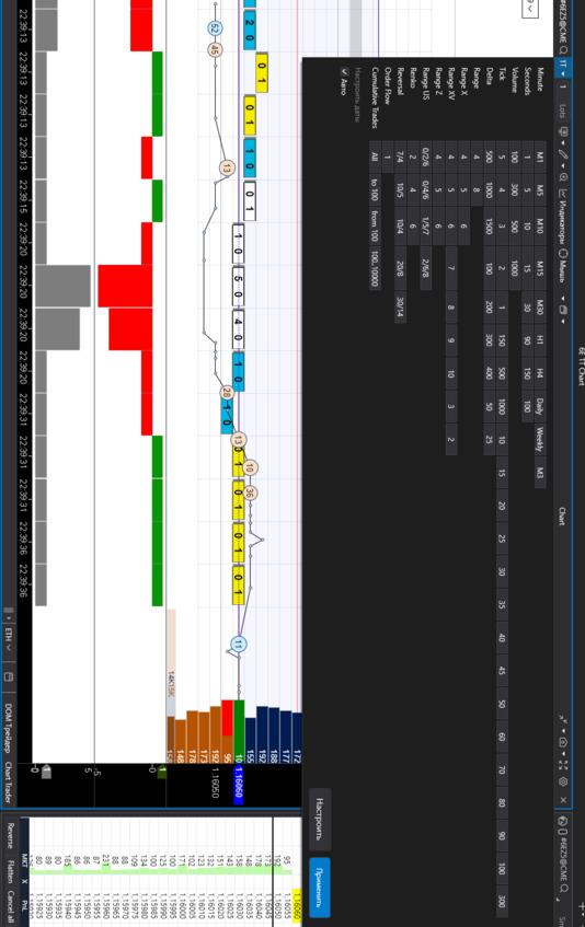
In the illustration: on the left, a 10-tick chart with a footprint and an overlaid DOM; on the right, a Smart DOM with limit orders and columns showing changes.

A) Bid/Ask and the Price Ladder
Price ladder. A vertical price scale with a discrete step (tick size). Each row is a possible execution level. The ladder defines the “grid” along which price can move: not by half a tick and not “in between” — only in multiples of the tick.
Best Bid (L1 Bid). The highest price buyers are currently willing to pay. This is the edge of the buy queue: if someone sells at market, execution starts here. The thicker the volume at L1 Bid, the larger the downside “cushion” — but only until it is pulled or consumed.
Best Ask (L1 Ask). The lowest price sellers are willing to accept. Any market buy will start matching here. Watch how often L1 Ask refreshes after hits — this hints at iceberg/absorption.
L2…Ln — depth. Subsequent levels on both sides. They form the near-term context: where “ladders” (repeating volume blocks) sit, where gaps appear, and where liquidity thins. Cumulative depth over the nearest 3–5 levels gives a sense of the local “heaviness” of price.
Level queue. At each level, limit orders line up according to exchange rules (often FIFO: price – time). First in, first filled. Change the price and you usually lose your place (modification = cancel + add). Hence the tactic: if queue position matters, avoid frequent changes; split size across multiple orders.
How this shows up in data
— Aggressive buying → matches occur on the Ask; volume at that level in the DOM decreases; the footprint prints “at Ask.”
— Aggressive selling → matches on the Bid; the tape shows “at Bid” prints.
— If a series of buys occurs while the Ask holds and the spread doesn’t widen → likely refresh/absorption. If, at the same time, upper levels are being pulled → prepare for an upside “poke.”
B) Spread and Mid
Spread = Ask₁ — Bid₁. The minimum gap between best quotes. On liquid contracts it often stays at 1 tick, but can instantly widen if:
— limits are pulled,
— the market receives a burst of aggression (market/stop flow),
— liquidity drops (session transitions, pauses, news).
Mid = (Bid₁ + Ask₁) /2. A convenient axis of short-term equilibrium. Relative to mid, bias is easy to see: persistent trading above → buyer dominance; below → seller dominance. Many pegged orders follow the mid, hence frequent micro-rearrangements at L1.
Reading spread dynamics
— Tightening to 1 tick with stable depth → a “dense” market, low entry costs; easier to build with limits.
— Choppy/wide spread (2–3 ticks or more) → thin book: expect more slippage; split size or switch to algorithmic execution.
— Tightening during buying without price movement → absorption: the Ask takes hits and refreshes.
— Widening with a print series → likely level break: limits leave, the aggressor probes the ladder.
Execution implications
— Narrow spread favors passive limits (maker rebates, lower impact).
— Wide spread favors small IOC/market slices; otherwise price control is lost.
— “1-tick stop” plans on variable-spread instruments are unrealistic: the stop can trigger on spread breathing alone.
Common mistakes
— Judging “side strength” from a single spread change while ignoring the tape.
— Confusing temporary news/auction widening with true liquidity weakness.
— Forgetting that mid can move without prints due to L1 reshuffling, not real flow.
C) Tick Size and Tick Value
Tick size. The minimum price increment. Price moves only in multiples of this step (discrete ladder). Examples: 0.25, 0.1, 0.005—instrument/exchange specific.
Tick value. The monetary value of one tick per contract, set by the contract spec (multiplier).
Examples
— Step = 0.25, multiplier = $50/point → 1 tick = 0.25 × $50 = $12.50.
— Step = 0.005, multiplier = €125,000/point → 1 tick = 0.005 × €125,000 = €625.
Why it matters
— Risk planning. Stops/targets in ticks; capital in money via tick value.
— Risk ($) = stop ticks × tick value × contracts.
— Setup realism. If average “breathing” noise is 2–3 ticks, a 1-tick stop will be hit statistically.
— Instrument comparison. Same tick size can mean different tick value → different cost of the same move.
— Commissions and spread. M