
автордың кітабын онлайн тегін оқу Writing & Illuminating, & Lettering
TRANSCRIBER'S NOTE
See Transcriber's Endnote for details of this transcription. Scans of the original printed book are available from archive.org/details/writingillumina00john.
THE ARTISTIC CRAFTS SERIES
OF TECHNICAL HANDBOOKS
EDITED BY W. R. LETHABY
WRITING & ILLUMINATING,
AND LETTERING
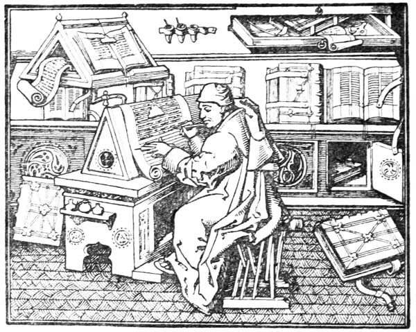
Frontispiece.
A SCRIPTORIUM
This drawing (about two-fifths of the linear size of the original) is made from a photograph of a miniature painted in an old MS. (written in 1456 at the Hague by Jean Mielot, Secretary to Philip the Good, Duke of Burgundy), now in the Paris National Library (MS. Fonds français 9,198).
It depicts Jean Mielot himself, writing his collection of Miracles of Our Lady in French. His parchment appears to be held steady by a weight and also by (? the knife or filler in) his left hand—compare fig. 41 in this book. Above there is a sort of reading desk, holding MSS. for copying or reference.
EDITOR’S PREFACE
In issuing these volumes of a series of Handbooks on the Artistic Crafts, it will be well to state what are our general aims.
In the first place, we wish to provide trustworthy text-books of workshop practice, from the points of view of experts who have critically examined the methods current in the shops, and putting aside vain survivals, are prepared to say what is good workmanship, and to set up a standard of quality in the crafts which are more especially associated with design. Secondly, in doing this, we hope to treat design itself as an essential part of good workmanship. During the last century most of the arts, save painting and sculpture of an academic kind, were little considered, and there was a tendency to look on “design” as a mere matter of appearance. Such “ornamentation” as there was was usually obtained by following in a mechanical way a drawing provided by an artist who often knew little of the technical processes involved in production. With the critical attention given to the crafts by [p-viii] Ruskin and Morris, it came to be seen that it was impossible to detach design from craft in this way, and that, in the widest sense, true design is an inseparable element of good quality, involving as it does the selection of good and suitable material, contrivance for special purpose, expert workmanship, proper finish, and so on, far more than mere ornament, and indeed, that ornamentation itself was rather an exuberance of fine workmanship than a matter of merely abstract lines. Workmanship when separated by too wide a gulf from fresh thought—that is, from design—inevitably decays, and, on the other hand, ornamentation, divorced from workmanship, is necessarily unreal, and quickly falls into affectation. Proper ornamentation may be defined as a language addressed to the eye; it is pleasant thought expressed in the speech of the tool.
In the third place, we would have this series put artistic craftsmanship before people as furnishing reasonable occupations for those who would gain a livelihood. Although within the bounds of academic art, the competition, of its kind, is so acute that only a very few per cent. can fairly hope to succeed as painters and sculptors; yet, as artistic craftsmen, there is every probability that nearly every one who would pass through a sufficient period of apprenticeship to workmanship and design would reach a measure of success.
In the blending of handwork and thought in [p-ix] such arts as we propose to deal with, happy careers may be found as far removed from the dreary routine of hack labour as from the terrible uncertainty of academic art. It is desirable in every way that men of good education should be brought back into the productive crafts: there are more than enough of us “in the city,” and it is probable that more consideration will be given in this century than in the last to Design and Workmanship.
· · ·
Of all the Arts, writing, perhaps, shows most clearly the formative force of the instruments used. In the analysis which Mr. Johnston gives us in this volume, nearly all seems to be explained by the two factors, utility and masterly use of tools. No one has ever invented a form of script, and herein lies the wonderful interest of the subject; the forms used have always formed themselves by a continuous process of development.
The curious assemblages of wedge-shaped indentations which make up Assyrian writing are a direct outcome of the clay cake, and the stylus used to imprint little marks on it. The forms of Chinese characters, it is evident, were made by quickly representing with a brush earlier pictorial signs. The Roman characters, which are our letters to-day, although their earlier forms have only come down to us cut in stone, must have been formed by incessant practice with a flat, stiff [p-x] brush, or some such tool. The disposition of the thicks and thins, and the exact shape of the curves, must have been settled by an instrument used rapidly; I suppose, indeed, that most of the great monumental inscriptions were designed in situ by a master writer, and only cut in by the mason, the cutting being merely a fixing, as it were, of the writing, and the cut inscriptions must always have been intended to be completed by painting.
All fine monumental inscriptions and types are but forms of writing modified according to the materials to which they are applied. The Italian type-founders of the fifteenth century sought out fine examples of old writing as models, and for their capitals studied the monumental Roman inscriptions. Roman letters were first introduced into English inscriptions by Italian artists. Torrigiano, on the tombs he made for [p-xi] Henry VII. in Westminster Abbey and for Dr. Young at the Rolls Chapel, designed probably the most beautiful inscriptions of this kind to be found in England.
This volume is remarkable for the way in which its subject seems to be developed inevitably. There is here no collection of all sorts of lettering, some sensible and many eccentric, for us to choose from, but we are shown the essentials of form and spacing, and the way is opened out to all who will devote practice to it to form an individual style by imperceptible variations from a fine standard.
Writing is for us the most universal of the Arts, and most craftsmen have to deal with lettering of a more formal kind. It is a commonplace of historical criticism to point out how much the Italian artists owed to the general practice amongst them of goldsmith’s work, a craft which required accuracy and delicacy of hand. We cannot go back to that, but we do need a basis of training in a demonstrably useful art, and I doubt if any is so generally fitted for the purpose of educating the hand, the eye, and the mind as this one of WRITING.
W. R. LETHABY.
October 1906.
TRANSCRIBER'S ENDNOTE.
Original spelling and grammar has been generally retained, with some exceptions noted below. Illustrations are moved from inside paragraphs to between paragraphs. Original printed page numbers are shown like this: [p052]. Original small caps LOOKS Like This. Left-clicking on headings of html level h2 or h3 will take the user to the List of Contents.
There are a great many cross references to Figures and other pages and footnotes. To aid the user, an Index of Hyperlinks to Specific Pages has been added: see below. The user may find it convenient, before clicking on a link, to make a mental note of his/her current page number location, in order to return there easily.
The symbol "", if it appears in a caption to a Collotype Plate, links back to the Note describing that Plate. The symbol "", if it appears in a caption to a figure, links to a larger version of the illustration. The extra-large images are available only in the html version. Most of the images have been refurbished, which means radically brightened, whitened, and sharpened. The Collotype Plates, however, have been subjected to only minor brightening and sharpening in the midrange, since radical changes necessarily destroy detail.
Most of the footnotes are renumbered into a single sequence and moved from the ends of pages to the ends of major sections, which are: the Author’s Preface, Part I, Part II, Appendix A, and Appendix B. Footnotes in the section "Notes on the Collotype Plates" are relocated to the end of the relevant Plate description.
Ditto marks are generally deleted, and replaced with repeated text if necessary. Large curly brackets, "{" or "}", used to indicate combination or grouping of information on two or more lines, have been eliminated from this ebook. Such information has been recast if necessary, preferring minimal changes, to retain the original meaning. The complex tables on page 72 and pages 162–3 are examples of such recasting.
Page viii: "ornamention" was changed to "ornamentation".
Page 214: "illluminated borders" changed to "illuminated borders".
Page 227: The Figure originally marked "Fig. 134a" on this page was changed to "Fig. 134d."
Page 239: The complex table was recast as a nested list.
Page 284: "occasionly" changed to "occasionally".
Page 430. The section "NOTES ON THE COLLOTYPE PLATES" was broken off in the midst of a paragraph on page 430, and continued on page 481, after the section "THE COLLOTYPE PLATES". Herein, this structure was retained, but the broken paragraph was closed, with all of it on page 430. A new html h2-level heading was inserted at the top of page 481.
Index, Entry "Black outlines": "88" changed to "188".
Index, Entry "Proportions and Methods": this entry was repeated, once between "Letters in Bands" and "Letters, Brush-made", and once in its proper alphabetical order. The first entry was deleted.
INDEX OF HYPERLINKS TO SPECIFIC PAGES
The following links are based on the original printed numbers. A left-click on any page number in the text, or on any Figure or Plate Title located in a caption, will bring the user here.
-
- iv
- vii
- x
- xii
- xiv
- xvi
- xviii
- xx
- xxii
- Addenda
- xxv
- xxvi
- Contents
-
- 035
- 037
- 039
- 041
- 043
- 045
- 047
- 049
- 051
- 053
- 055
- 057
- 059
- 061
- 063
- 065
- 067
- 069
- 071
- 073
- 076
- 077
- 079
- 082
- 083
- 085
- 087
- 089
- 091
- 094
- 095
- 097
- 099
- 101
- 102
- 104
- 107
- 109
- 111
- 113
- 115
- 118
- 119
- 121
- 123
- 125
- 127
- 129
- 131
- 133
- 135
- 137
- 139
- 141
- 144
- 145
- 147
- 149
- 151
- 153
- 155
- 157
- 159
- 161
- 163
- 165
- 167
- 169
- 171
- 173
- 175
- 177
- 179
- 181
- 183
- 185
- 187
- 189
- 191
- 193
- 195
- 197
- 199
- 201
- 203
- 205
- 208
- 209
- 211
- 214
- 215
- 218
- 219
- 221
- 223
- 227
- 237
- 239
- 241
- 244
- 245
- 247
- 250
- 251
- 253
- 255
- 258
- 259
- 262
- 263
- 265
- 267
- 269
- 271
- 273
- 275
- 278
- 281
- 283
- 285
- 287
- 289
- 291
- 293
- 296
- 297
- 299
- 302
- 304
- 305
- 310
- 311
- 314
- 315
- 317
- 321
- 323
- 326
- 327
- 329
- 331
- 336
- 337
- 341
- 343
- 345
- 347
- 349
- 351
- 353
- 355
- 357
- 360
- 361
- 363
- 365
- 367
- 369
- 371
- 373
- 375
- 377
- 378
- 384
- 385
- 387
- 389
- 391
- 393
- 395
- 397
- 399
- 401
- 403
- 405
- 406
- 409
- 411
- 413
- 415
- 417
- 419
- 421
- 423
- 425
- 427
- 429
- 431
- 481
- 483
- 485
- 487
- Index
- Ads
-
- Plates P1
- P2
- P3
- P4
- P5
- P6
- P7
- P8
- P9
- P10
- P11
- P12
- P13
- P14
- P15
- P16
- P17
- P18
- P19
- P20
- P21
- P22
- P23
- P24
Fig. 41.
[p-xii]
“We must set up the strong present tense against all the rumours of wrath, past or to come. So many things are unsettled which it is of the first importance to settle,—and, pending their settlement, we will do as we do. . . . Expediency of literature, reason of literature, lawfulness of writing down a thought, is questioned; much is to say on both sides, and, while the fight waxes hot, thou, dearest scholar, stick to thy foolish task, add a line every hour, and between whiles add a line. Right to hold land, right of property is disputed, and the conventions convene, and before the vote is taken, dig away in your garden, and spend your earnings as a waif or godsend to all serene and beautiful purposes. Life itself is a bubble and a scepticism, and a sleep within a sleep. Grant it, and as much more as they will,—but thou, God’s darling! heed thy private dream: thou wilt not be missed in the scorning and scepticism: there are enough of them: stay there in thy closet, and toil, until the rest are agreed what to do about it. Thy sickness, they say, and thy puny habit, require that thou do this or avoid that, but know that thy life is a flitting state, a tent for a night, and do thou, sick or well, finish that stint. Thou art sick, but shall not be worse, and the universe, which holds thee dear, shall be the better.”
—Emerson.
“I began to think that if I should discover how to make enamels, I could make earthen vessels and other things very prettily, because God had gifted me with some knowledge of drawing. And thereafter, regardless of the fact that I had no knowledge of drugs, I began to seek for the enamels as a man gropes in the dark.”
—Palissy.
“. . . in that communion only, beholding beauty with the eye of the mind, he will be enabled to bring forth, not images of beauty, but realities (for he has hold not of an image but of a reality), and bringing forth and nourishing true virtue to become the friend of God and be immortal, if mortal man may.”
—Plato.
AUTHOR’S PREFACE
WRITING
The arts of WRITING, ILLUMINATING, & LETTERING offer a wide field for the ingenious and careful craftsman and open the way to a number of delightful occupations. Beyond their many uses—some of which are referred to below—they have a very great educational value. This has long been recognized in the teaching of elementary design, and the practice of designing Alphabets and Inscriptions is now common in most Schools of Art. Much would be gained by substituting, generally, WRITING for designing, because writing being the medium by which nearly all our letters have been evolved from the Roman Capital (see p. 35), the use of the pen—essentially a letter-making tool—gives a practical insight into the construction of letters attainable in no other way. The most important use of letters is in the making of books, and the foundations of typography and book decoration may be mastered—as they were laid—by the planning, writing, and illuminating of MSS. in book form. Of this a modern printer (see also p. 368) says:
“In the making of the Written Book, . . . . . . the adjustment of letter to letter, of word to word, of picture to text and of text to picture, and of the whole to the subject matter and to the page, admits of great nicety and perfection. The type is fluid, and the letters and words, picture, text, and page are conceived of as one and are all executed by one hand, or by several hands all working together without intermediation on one identical page and [p-xiv] with a view to one identical effect. In the Printed Book this adjustment is more difficult. . . . . . . Yet in the making of the printed book, as in the making of the written book, this adjustment is essential, and should be specially borne in mind, and Calligraphy and immediate decoration by hand and the unity which should be inseparably associated therewith would serve as an admirable discipline to that end.”
And though calligraphy is a means to many ends, a fine MS. has a beauty of its own that—if two arts may be compared—surpasses that of the finest printing. This in itself would justify the transcribing and preservation of much good literature in this beautiful form (besides the preparation of “Illuminated Addresses,” Service Books, Heraldic and other MSS.) and make the practice of formal writing desirable. And furthermore as the old-fashioned notion that a legible hand is a mark of bad breeding dies out, it may be that our current handwriting will take legibility and beauty from such practice. And even the strict utilitarian could not fail to value the benefits that might some day come to men, if children learnt to appreciate beauty of form in their letters and in their writing the beauty of carefulness.
ILLUMINATING
Of the practice of ILLUMINATING—properly associated with writing—it may be observed that, among various ways of acquiring a knowledge of the elements of design & decoration it is one of the most simple and complete. Moreover, a fine illumination or miniature has a beauty of its own that may surpass the finest printed book-decoration. And pictures in books may be as desirable as pictures on the wall—even though like the beautiful household gods of the Japanese they are kept in safe hiding and displayed only now and then. [p-xv]
LETTERING
Magnificent as are the dreams of a fine Decoration based on lettering, the innumerable practical applications of LETTERING itself (see Chap. XVI.) make the study of Letter-Craft not only desirable but imperative. And perhaps I may here be permitted to quote from The Athenæum of Feb. 3, 1906, which says of “the new school of scribes and designers of inscriptions”
“These have attacked the problem of applied design in one of its simplest and most universal applications, and they have already done a great deal to establish a standard by which we shall be bound to revise all printed and written lettering. If once the principles they have established could gain currency, what a load of ugliness would be lifted from modern civilization! If once the names of streets and houses, and, let us hope, even the announcements of advertisers, were executed in beautifully designed and well-spaced letters, the eye would become so accustomed to good proportion in these simple and obvious things that it would insist on a similar gratification in more complex and difficult matters.”
Yet Ordinary Writing and even scribbling has had, and still might have, a good influence on the art of the Letter maker, and at least the common use of pen, ink, & paper makes it a simple matter for any one to essay a formal or ‘book’ hand. A broad nib cut to give clean thick and thin strokes (without appreciable variation of pressure) will teach any one who cares to learn, very clearly and certainly. And though much practice goes to the making of a perfect MS., it is easier than people suppose to make really beautiful things by taking a little pains. As “copy book” hands simple, primitive pen-forms—such as the Uncial & Half-Uncial (pp. 38, 70)—afford the best training and permit [p-xvi] the cultivation of the freedom which is essential in writing: they prepare the way for the mastery of the most practical characters—the ROMAN CAPITAL, roman small-letter, & Italic—and the ultimate development of a lively and personal penmanship.
MODERN DEVELOPMENT OF WRITING & ILLUMINATING
Developing, or rather re-developing, an art involves the tracing in one’s own experience of a process resembling its past development. And it is by such a course that we, who wish to revive Writing & Illuminating, may renew them, evolving new methods and traditions for ourselves, till at length we attain a modern and beautiful technique. And if we would be more than amateurs, we must study and practise the making of beautiful THINGS and thereby gain experience of Tools, Materials, and Methods. For it is certain that we must teach ourselves how to make beautiful things, and must have some notion of the aim and bent of our work, of what we seek and what we do.
Early illuminated MSS. and printed books with woodcuts (or good facsimiles) may be studied with advantage by the would-be Illuminator, and he should if possible learn to draw from hedgerows and from country gardens. In his practice he should begin as a scribe making MS. books and then decorating them with simple pen & colour work. We may pass most naturally from writing to the decoration of writing, by the making and placing of initial letters. For in seeking first a fine effectiveness we may put readableness before “looks” and, generally, make a text to read smoothly, broken only by its natural division into paragraphs, chapters, and the like. But these divisions, suggesting that a pause in reading is desirable, suggest also that [p-xvii] a mark is required—as in music—indicating the “rest”: this a large capital does most effectively.
A technical division of illumination into Colour-work, Pen-work, and Draughtsmanship is convenient (see Chap. XI.). Though these are properly combined in practice, it is suggested that, at first, it will be helpful to think of their effects as distinct so that we may attain quite definitely some mastery of pure, bright, colours & simple colour effects, of pen flourishing and ornament, and of drawing—whether plain or coloured, that will go decoratively with writing or printing. This distinction makes it easier to devise definite schemes of illumination that will be within our power to carry out at any stage of our development. And while the penman inevitably gains some power of pen decoration it is well for him as an illuminator to practise in bright colours and gold; for illumination may be as brilliant and splendid in its own way as stained glass, enamels, and jewellery are in theirs.1 At first, at any rate, hues that have the least suspicion of being dull or weak are to be avoided as though they were plainly “muddy” or “washed-out.” The more definite we make our work the more definitely will our materials instruct us; and such service must precede mastery.
MODERN DEVELOPMENT OF LETTERING
Referring again to good LETTERING: the second part of this book deals with some of its Qualities, Forms—the Roman Capitals & their important pen-derivatives—and Uses. It is written [p-xviii] largely from the penman’s point of view,2 but a chapter on inscriptions in stone has been added and various types and modes of letter making are discussed. The essential qualities of Lettering are legibility, beauty, and character, and these are to be found in numberless inscriptions and writings of the last two thousand years. But since the traditions of the early scribes and printers and carvers have decayed, we have become so used to inferior forms and arrangements that we hardly realize how poor the bulk of modern lettering really is. In the recent “revival” of printing and book decoration, many attempts have been made to design fine alphabets and beautiful books—in a number of cases with notable success. But the study of Palæography and Typography has hitherto been confined to a few specialists, and these attempts to make “” books often shew a vagueness of intention, which weakens their interest and an ignorance of Letter-craft which makes the poorest, ordinary printing seem pleasant by comparison. The development of Letters was a purely natural process in the course of which distinct and characteristic types were evolved and some knowledge of how these came into being will help us in understanding their anatomy and distinguishing good and bad forms. A comparatively little study of old manuscripts and inscriptions will make clear much of the beauty and method of the early work. And we may accustom ourselves to good lettering by carefully studying such examples as we can find, and acquire a practical knowledge [p-xix] of it by copying from them with a pen or chisel or other letter-making tool. A conscientious endeavour to make our lettering readable, and models3 and methods chosen to that end, will keep our work straight: and after all the problem before us is fairly simple—To make good letters and to arrange them well. To make good letters is not necessarily to “design” them—they have been designed long ago—but it is to take the best letters we can find, and to acquire them and make them our own. To arrange letters well requires no great art, but it requires a practical knowledge of letter-forms and of the rational methods of grouping these forms to suit every circumstance.
THE SCOPE OF THIS HANDBOOK
Generally this book has been planned as a sort of “guide” to models and methods for Letter-craftsmen and Students—more particularly for those who cannot see the actual processes of Writing, Illuminating, &c. carried out, and who may not have access to collections of MSS. Much of, if not all, the explanation is of the most obvious, but that, I hope, gives it more nearly the value of a practical demonstration. In describing methods and processes I have generally used the present tense—saying that they “are—”: this is to be taken as meaning that they are so in early MSS. and inscriptions, and in the practice of the modern school of scribes who found their work on them.
Regarding the copying of early work (see pp. 195, 323, &c.) it is contended that to revive an art [p-xx] one must begin at the beginning, and that, in an honest attempt to achieve a simple end, one may lawfully follow a method4 without imitating a style. We have an excellent precedent in the Italian scribes who went back 300 years for a model and gave us the Roman small-letter as a result (see p. 47). The beginners attitude is largely, and necessarily, imitative, and at this time we should have much to hope from a school of Artist-Beginners who would make good construction the only novelty in their work. We have almost as much—or as little—to be afraid of in Originality as in imitation, and our best attitude towards this problem is that of the Irishman with a difficulty—“to look it boldly in the face and pass on”—making an honest attempt to achieve a simple end. Perhaps we trouble too much about what we “ought to do” & “do”: it is of greater moment to know what we are doing & trying to do. In so far as tradition fails to bound or guide us we must think for ourselves and in practice make methods and rules for ourselves: endeavouring that our work should be effective rather than have “a fine effect”—or be, rather than appear, good—and following our craft rather than making it follow us. For all things—materials, tools, methods—are waiting to serve us and [p-xxi] we have only to find the “spell” that will set the whole universe a-making for us.
Endeavouring to attain this freedom we may make Rules and Methods serve us (see p. 221), knowing that Rules are only Guides and that Methods are suggested by the work itself: from first to last our necessary equipment consists in good models, good tools, & a good will. Within the limits of our craft we cannot have too much freedom; for too much fitting & planning makes the work lifeless, and it is conceivable that in the finest work the Rules are concealed, and that, for example, a MS. might be most beautiful without ruled lines and methodical arrangement (see p. 343). But the more clearly we realize our limitations the more practical our work. And it is rather as a stimulus to definite thought—not as an embodiment of hard and fast rules—that various methodical plans & tables of comparison & analysis are given in this book. It is well to recognize at once, the fact that mere taking to pieces, or analysing, followed by “putting together,” is only a means of becoming acquainted with the mechanism of construction, and will not reproduce the original beauty of a thing: it is an education for work, but all work which is honest and straightforward has a beauty and freshness of its own.
The commercial prospects of the student of Writing & Illuminating—or, indeed, of any Art or Craft—are somewhat problematical, depending largely on his efficiency & opportunities. There is a fairly steady demand for Illuminated Addresses; but the independent craftsman would have to establish himself by useful practice, and by seizing opportunities, and by doing his work well. Only an attempt [p-xxii] to do practical work will raise practical problems, and therefore useful practice is the making of real or definite things. In the special conditions attaching to work which the craftsman is commissioned to do for another person, there is a great advantage. And the beginner by setting himself specific tasks (for example: making a MS. book for a specific purpose—see p. 100) should give reality to his work. As a craftsman in Lettering he might get work in some of the directions mentioned in pp. 337–341.
Although the demand for good work is at present limited, the production of good work will inevitably create a demand; and, finally, the value of Quality is always recognized—sooner or later, but inevitably—and whatever “practical” reasons we may hear urged in favour of Quantity, the value of Quality is gaining recognition every day in commerce and even in art, and there or here, sooner or later we shall know that we can afford the best.
EDWARD JOHNSTON.
October 1906.
My thanks are due to Mr. T. J. Cobden-Sanderson, to Mr. Emery Walker, and to Mr. George Allen for quotations: to Mr. Graily Hewitt, to Mr. Douglas Cockerell, to Mr. A. E. R. Gill, to Mr. C. M. Firth, and to Mr. G. Loumyer, for special contributions on gilding, binding, and inscription-cutting: to Mr. S. C. Cockerell for several of the plates: to Mr. W. H. Cowlishaw, to the Rev. Dr. T. K. Abbott, to Dr. F. S. Kenyon of the New Palæographical Society, to the Vicar of Holy Trinity Church, Hastings, to the Secretary of the Board of Education, S. Kensington, to Mr. H. Yates-Thompson, to Mr. G. H. Powell, and to others, for permission to reproduce photographs, &c.: and to Mr. Noel Rooke and G. J. H. for assistance with the illustrations and many other matters: I should like, moreover, to acknowledge my indebtedness to Mr. W. R. Lethaby and Mr. S. C. Cockerell for encouragement and advice in years past.
E. J.
FOOTNOTES TO AUTHOR’S PREFACE:
1 See Chap. XVI. “Of Colour” in “Stained Glass Work” by C. W. Whall, in this Series, and the illuminator might profit by the suggestion (ibid., p. 232) of playing with a home-made kaleidoscope.
2 Dealing with the practical and theoretical knowledge of letter-making and arrangement which may be gained most effectually by the use of the pen.
3 In making choice of a model we seek an essentially legible character, remembering that our personal view of legibility is apt to favour custom and use unduly, for a quite bad, familiar writing may seem to us more readable than one that is far clearer in itself but unfamiliar.
4 Much remains to be found out and done in the matter of improving tools & materials & processes, and it would be preferable that the rediscovery of simple, old methods should precede new & complex inventions. We still find the Quill—for its substance & for shaping it and keeping it sharp—is a better tool than a modern gold or metal pen (see p. 60). The old parchment, paper, ink, gilding-size & colours are all much better than those now obtainable (see pp. 51, 167, 173, 178–179). I should greatly appreciate any advice from illuminators and letter-craftsmen as to materials and methods, and should endeavour to make such information available to others.—E. J.
ADDENDA & CORRIGENDA
P. 51. Beginners practising large writing may more easily use a thin, or diluted, ink: in small writing this does not show up the faults with sufficient clearness.
P. 59. Quills often have a sort of skin (which tends to make a ragged nib), this should be scraped off the back.
P. 63. Until the simple pen-stroke forms are mastered, the pen should be used without appreciable pressure. With practice one gains sleight of hand (pp. 85, 311), and slightly changing pressures & quick movements on to the corners, or points, of the nib are used. The forms in the best MSS. shew such variations; e.g. the Uncials in fig. 5 appear to have been made with varying pressure (perhaps with a soft reed) & their fine finishing-strokes with the nib-point (comp. forms in fig. 146). Versals likewise shew varying, and sometimes uncertain, structures that suggest a form consisting of strokes other than definite pen strokes. [p-xxv]

Figs. a to n, illustrating Addenda & Corrigenda.

P. 64. A nib may be sharpened several times, before it is re-cut, by paring it underneath (fig. a).
Pp. 73 & 81. The thin finishing-strokes of j, & F, G, J, N, are made with the point of the nib—see note p. 63 above.
P. 99. The plan of a paper scale is shewn in fig. b.
P. 109. The dots for lines were often pricked through the edges of the book-sheets which were cut off after ruling (fig. c).
P. 118. The spread or wedge-shaped thin stroke, sometimes very strongly marked, is common in early forms (fig. d).
P. 144.


P. 208. Ornamental Letter forms may consist of flourishes, patterns, leaves, flowers, &c. (see fig. f).
Pp. 215–217. Diapering generally means the variegation, figuring, or flowering, of a plain or patterned surface, with a finer pattern (see fig. 191a). Some diagrams of simple patterns (g–g2 from modern cantagalli ware) are shewn in fig. g. Note: the more solid penwork line-fillings in figs. 87, 126, make effective framing borders (see fig. h).
Pp. 219–220. Note: the principle of breaking straight or long lines, mentioned in regard to background edges (p. 190), and illustrated in the line-finishings (fig. 126) and flourishes (fig. 79), is related to branching out and is re-creative, whereas the prolonged line is tiresome (see figs. k, k1, & comp. k2).
P. 249. The B & D should be round-shouldered—see note p. 280 below. [p-xxvi]
P. 260. It is sometimes better to make narrow forms than to combine wide ones—example fig. l.
Pp. 270–275. Pp. 280–288. The large types—“Old Face” (founded on Caslon Type) and “Old French” (modern) respectively—are used in these pages as reference or index letters (not as models).
P. 280. Generally round-shouldered letters have finer and more stable forms than square-shouldered, and generally emphasis should be laid on the strong, thick stroke running obliquely down from left to right (


P. 324. Commonly letters are made more slender in proportion as they are made larger, and it is generally not desirable (or possible) in practical work to have exactly similar proportions in large and small lettering.
P. 325. g from fig. 173 inaccurate—comp. fig. 173 & see fig. n.
P. 331. Ornamental letters—see note p. 208 above.
P. 481. A small writing is often the most practical—in the matter of speed in reading and less bulk in the MS., besides speed in the writing of it—but it is more difficult for the beginner to write it well and it is apt to lose some of the virtues of formal penmanship (see Fine-pen writing pp. 59, 86, 311, 324, 482).
P. 485. Oblique thin stroke—see note p. 280 above.
CONTENTS
- Editor’s Preface vii
- Author’s Preface xiii
- Addenda & Corrigenda xxiii
-
PART I
WRITING & ILLUMINATING-
CHAPTER I
THE DEVELOPMENT OF WRITING 35
-
CHAPTER II
ACQUIRING A FORMAL HAND: (1) TOOLS
Acquiring a Formal Hand: Tools, &c. — The Desk — Paper & Ink — Pens: The Reed: The Quill — Of Quills generally — Pen-knife, Cutting-slab, &c. 48
-
CHAPTER III
ACQUIRING A FORMAL HAND: (2) METHODS
Position of the Desk — The Writing Level — Use of the Pen — Holding the Pen — Filling the Pen, &c. 61
-
CHAPTER IV
ACQUIRING A FORMAL HAND: (3) MODELS
Models — Notes on Construction: Script I. — Coupling the Letters — Spacing: Letters, Words, & Lines — Uncial Capitals: Script II. — Numerals & Punctuation Marks — Of Copying MSS. Generally 70
-
CHAPTER V
ACQUIRING A FORMAL HAND: (4) PRACTICE
Practice — Scripts I. & II. — Arranging & Ruling a Single Sheet — Problem I. (a Sheet of Prose) — Problem II. (a Sheet of Poetry) — Spacing & Planning Manuscript 85
-
CHAPTER VI
MANUSCRIPT BOOKS
MS. Books: Tools & Materials — Methods & Proportions — The Size & Shape of the Book — The Widths of the Margins — The Size of the Writing, &c. — Ruling — MS. Books: General Remarks 98
-
CHAPTER VII
VERSAL LETTERS & COLOURED CAPITALS
Development of Versals — General Analysis of Versals — Notes on Construction of Versals — Spacing & Arrangement of Versals 112
-
CHAPTER VIII
BLACK & RED
Rubricating — Initial Pages or Title Pages — Prefaces & Notes in Colour — Pages with Coloured Headings — Page or Column Heading & Initial — Versals in Column or Marginal Bands — Stanzas or Verses marked by Versals — Music with Red Staves — Tail-Pieces, Colophons, &c. — Rubricating: General Remarks 127
-
CHAPTER IX
LAYING & BURNISHING GOLD
Tools & Materials — Laying the Ground — Laying the Gold-Leaf — Burnishing the Gold — Remedying Faults in Gilding — Gold Writing — Other Methods & Recipes for Gilding — Appendix on Gilding (by Graily Hewitt) 145
-
CHAPTER X
THE USE OF GOLD & COLOURS IN INITIAL LETTERS & SIMPLE ILLUMINATION
Tools & Materials for Simple Illumination — Parchment, “Vellum,” & Pounce — Colours — Simple Colour Effects — Matt Gold — Burnished Gold — Burnished Gold Forms, & Outlines — Background Capitals — Applying the Background — Ornament of Backgrounds 172
-
CHAPTER XI
A THEORY OF ILLUMINATION
Illumination — “Barbaric, or Colour-Work, Illumination” — “Filigree, or Pen-Work, Illumination” — “Natural, or Limner’s, Illumination” 193
-
CHAPTER XII
THE DEVELOPMENT OF ILLUMINATION
The Development of Illumination — Line-Finishings — Initial Letters — Borders & Backgrounds 204
-
CHAPTER XIII
“DESIGN” IN ILLUMINATION
“Design” — Elementary Patterns in Decoration — Scale & Scope of Decoration — Of “Designing” Manuscripts, Generally 214
-
-
PART II
LETTERING-
CHAPTER XIV
GOOD LETTERING — SOME METHODS OF CONSTRUCTION & ARRANGEMENT
Good Models — The Qualities of Good Lettering — Simplicity — Distinctiveness — Proportion — Beauty of Form — Beauty of Uniformity — Right Arrangement — Setting Out & Fitting In — “Massed Writing” & “Fine Writing” — Even Spacing — Theory & Practice 237
-
CHAPTER XV
THE ROMAN ALPHABET & ITS DERIVATIVES
The Roman Alphabet — Proportions of Letters: Widths — Upper & Lower Parts — Essential or Structural Forms — Characterisation of Forms — Built-Up Forms — Simple-Written Capitals — Uncials — Capitals & Small-Letters — Early, Round, Upright, Formal Hands — Slanted-Pen Small-Letters — Roman Small-Letters — Italics — Semi-Formal Hands — Of Formal Writing Generally — Decorative Contrasts — Ornamental Letters 268
-
-
APPENDIX A
-
CHAPTER XVI
SPECIAL SUBJECTS
Divers Uses of Lettering — MS. Books, &c. — Binding MSS (with Note by Douglas Cockerell) — Broadsides, Wall Inscriptions, &c. — Illuminated Addresses, &c. — Monograms & Devices — Title Pages — Lettering for Reproduction — Printing — Inscriptions on Metal, Stone, Wood, &c. — Of Inscriptions Generally — Bibliography, &c. 337
-
-
APPENDIX B
-
CHAPTER XVII
INSCRIPTIONS IN STONE
(By A. E. R. Gill)
Treatment & Arrangement — The Three Alphabets — Size & Spacing — The Material — Setting Out — Tools — A Right Use of the Chisel — Incised Letters & Letters in Relief — The Sections of Letters — Working in situ 389
-
- Notes on the Collotype Plates 407
- The Collotype Plates 431
- Index 489
PART I WRITING
 ILLUMINATING
PART I WRITING ILLUMINATING CHAPTER I THE DEVELOPMENT OF WRITING
[p368]
[p038]
[p070]
1 See Chap. XVI. “Of Colour” in “Stained Glass Work” by C. W. Whall, in this Series, and the illuminator might profit by the suggestion (ibid., p. 232) of playing with a home-made kaleidoscope.
2 Dealing with the practical and theoretical knowledge of letter-making and arrangement which may be gained most effectually by the use of the pen.
3 In making choice of a model we seek an essentially legible character, remembering that our personal view of legibility is apt to favour custom and use unduly, for a quite bad, familiar writing may seem to us more readable than one that is far clearer in itself but unfamiliar.
[p195]
[p323]
4 Much remains to be found out and done in the matter of improving tools & materials & processes, and it would be preferable that the rediscovery of simple, old methods should precede new & complex inventions. We still find the Quill—for its substance & for shaping it and keeping it sharp—is a better tool than a modern gold or metal pen (see p. 60). The old parchment, paper, ink, gilding-size & colours are all much better than those now obtainable (see pp. 51, 167, 173, 178–179). I should greatly appreciate any advice from illuminators and letter-craftsmen as to materials and methods, and should endeavour to make such information available to others.—E. J.
[p047]
[p221]
[p343]
[p100]
APPENDIX A
All the arts employ lettering directly or indirectly, in fine decoration or for simple service.
[p060]
[p051]
[p167]
[p173]
[p178]
[p179]
[p059]
[p063]
[p085]
[p311]
Fig. 5.—Psalter, fifth century.
Fig. 146.
[p064]
[p073]
Fig. 57.
[p099]
[p109]
NOTES ON CONSTRUCTION OF VERSALS
(See figs. 80, 81, 85, 165)
[p144]
[p208]
[p215]
Fig. 130.
Fig. 87.
Fig. 126.
[p219]
[p220]
[p190]
Fig. 79. (13th century).
Fig. 148.
[p260]
[p270]
[p275]
[p280]
[p288]
[p485]
[p324]
Fig. 183.
Fig. 173.—Part of Plate IX. (Charter of CNUT), enlarged three times linear (see p. 416).
[p331]
NOTES ON THE PLATES Plate XIX, Continued
[p086]
[p482]
NOTES ON THE COLLOTYPE PLATES (Note.—In order to make the illustrations [whether of facsimiles or enlargements] as large and as full as possible, I have sacrificed “appearance” to use and allowed most of the collotype plates, and many of the diagrams in the book, to encroach on the margins.—E. J.)
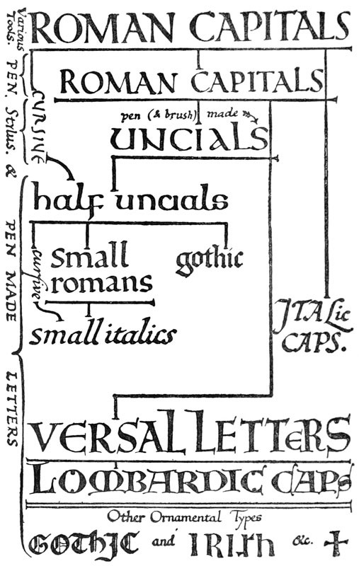
Fig. 1.
PART I WRITING
ILLUMINATING CHAPTER I THE DEVELOPMENT OF WRITING
Nearly every type of letter with which we are familiar is derived from the Roman Capitals, and has come to us through the medium, or been modified by the influence, of the pen. And, therefore, in trying to revive good Lettering, we cannot do better than make a practical study of the best pen-forms, and learn at the same time to appreciate the forms of their magnificent archetypes as preserved in the monumental Roman inscriptions.
The development and the relations of the principal types of letters are briefly set out in the accompanying “family tree”—fig. 1. When the student has learnt to cut and handle a pen, he can trace this development practically by trying to copy a few words from each example given below. [p036]
THE ROMAN ALPHABET.—The Alphabet, as we know it, begins with the ROMAN CAPITALS5 (see fig. 2). Their fine monumental forms were evolved by the use of the chisel—probably under the influence of writing—and had reached full development about 2000 years ago (see Plates I., II., and Chapter XV.).
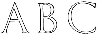
Fig. 2.
FORMAL WRITING—the “book-hand” or professional writing of the scribes—comes of the careful writing of the Roman Capitals (see also footnote, p. 38, on the beginnings of fine penmanship). It was the—
“literary hand, used in the production of exactly written MSS., and therefore a hand of comparatively limited use. By its side, and of course of far more extensive and general use, was the cursive hand of the time”6 [p037]
In early cursive writing—the running-hand or ordinary writing of the people—
“The Letters are nothing more than the old Roman letters written with speed, and thus undergoing certain modifications in their forms, which eventually developed into the minuscule hand.”7 (See fig. 3.)
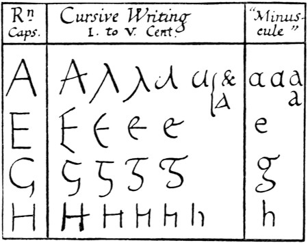
Fig. 3.
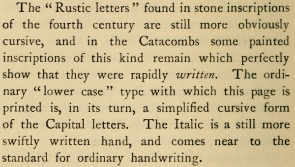
Here it is sufficient to trace the history of the formal Latin “hands,” but the continual, modifying influence exerted on them by the ordinary cursive writing should be borne in mind. Notable results of this influence are seen in Half-Uncials and Italics.
SQUARE CAPITALS were formal, pen-made Roman Capitals, of the monumental type: they were used (perhaps from the second) till about the [p038] end of the fifth century for important books (see Plate III.).
RUSTIC CAPITALS were probably a variety of the “Square Capitals,” and were in use till about the end of the fifth century (fig. 4; see also p. 297).
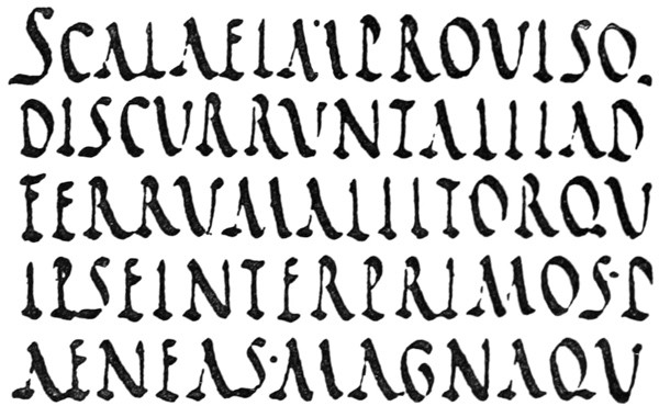
Fig. 4.—Æneid, on vellum, third or fourth century.
ROMAN UNCIALS were fully developed by the fourth century, and were used from the fifth till the eighth century for the finest books (fig. 5).
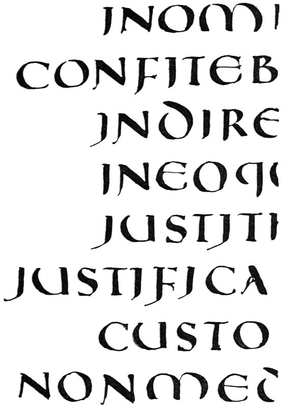
Fig. 5.—Psalter, fifth century.
Uncials are true pen-forms8—more quickly written than the “Square,” and clearer than the “Rustic” Capitals—having the characteristic, simple strokes and beautiful, rounded shapes which flow from the rightly handled reed or quill. The [p040] typical Uncial letters are the round D, E, H, M, U (or V), and A and Q (see p. 300).
ROMAN HALF-UNCIALS—or Semi-Uncials—(fig. 6) were mixed Uncial and Cursive forms adopted by the scribes for ease and quickness in writing. Their evolution marks the formal change from Capitals to “Small-Letters.”
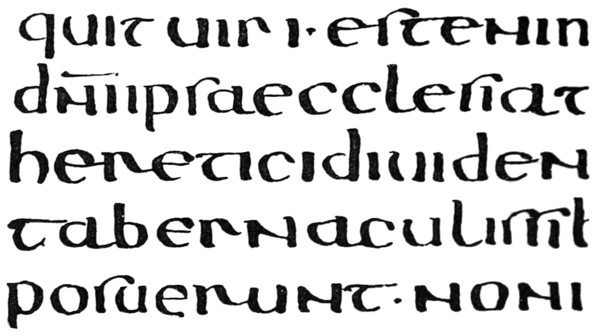
Fig. 6.—S. Augustine: probably French sixth century.
They were first used as a book-hand for the less important books about the beginning of the sixth century.
IRISH HALF-UNCIALS were founded on the Roman Half-Uncials (probably brought to Ireland by Roman missionaries in the sixth century). As a beautiful writing, they attained in the seventh century a degree of perfection since unrivalled (see Plate VI.).
They developed in the eighth and ninth centuries into a “pointed” writing, which became the Irish national hand.
ENGLISH HALF-UNCIALS (fig. 7) were modelled on the Irish Half-Uncials in the seventh [p041] century. They also developed in the eighth and ninth centuries into a “pointed” writing.
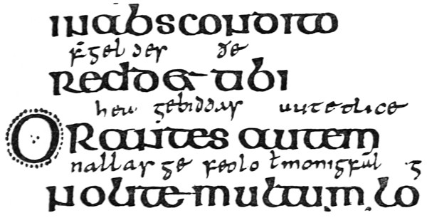
Fig. 7.—“Durham Book”: Lindisfarne, about A.D. 700.
(See also Plate VII.)
CAROLINE (or CARLOVINGIAN) WRITING.—While English and Irish writing thus came from Roman Half-Uncial, the Continental hands were much influenced by the rougher Roman Cursive, and were, till near the end of the eighth century, comparatively poor.
“The period of Charlemagne is an epoch in the history of the handwritings of Western Europe. With the revival of learning naturally came a reform of the writing in which the works of literature were to be made known. A decree of the year 789 called for the revision of church books; and this work naturally brought with it a great activity in the writing schools of the chief monastic centres of France. And in none was there greater activity than at Tours, where, under the rule of Alcuin of York, who was abbot of St. Martin’s from 796 to 804, was specially developed the exact hand which has received the name of the Caroline Minuscule.”9 [p042]
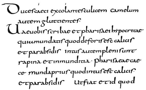
Fig. 8.—British Museum: Harl. MS. 2790. Caroline MS. first half of 9th century. (See also fig. 171 & p. 305.)
[p043]
The influence of the Caroline hands (see fig. 8) presently spread throughout Europe. The letters in our modern copy-books may be regarded as their direct, though degenerate, descendants.
SLANTED-PEN or TILTED WRITING.—The forms of the letters in early writing indicate an easily held pen—slanted away from the right shoulder. The slanted pen naturally produced oblique thick strokes and thin strokes, and the letters were “tilted” (see fig. 9).
In the highly finished hands—used from the sixth to the eighth centuries—such as the later Uncials and the Roman, Irish, and English Half-Uncials, the pen was manipulated or cut so that the thin strokes were approximately horizontal, and the thick strokes vertical (fig. 10). The earlier and easier practice came into fashion again in the eighth and ninth centuries, and the round Irish and English hands became “pointed” as a result of slanting the pen.
The alteration in widths and directions of pen strokes, due to the use of the “slanted pen,” had these effects on the half-uncial forms (see fig. 11):—
1. The thin strokes taking an oblique (upward) direction (a) (giving a sharp angle with the verticals (d, a)) led to angularity and narrower forms (a1), and a marked contrast between thick and thin strokes—due to the abrupt change from one to the other (a2).
2. The thick strokes becoming oblique (b) caused a thickening of the curves below on the left (b1), and above on the right (b2), which gave heavy shoulders and feet.
3. The horizontal strokes becoming thicker (c) gave stronger and less elegant forms. [p044]
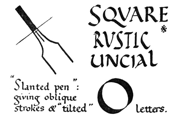
Fig. 9.
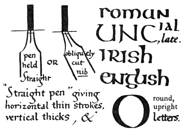
Fig. 10.
[p045]
4. The vertical strokes becoming thinner (d) (with oblique or pointed ends—not square ended) increased the tendency to narrow letters.
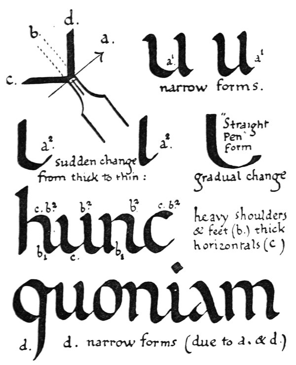
Fig. 11.
It is to be noted that the Caroline letters—though written with a “slanted pen”—kept the open, round appearance of the earlier forms. [p046]
TENTH, ELEVENTH, AND TWELFTH CENTURY WRITING.—The easy use of the slanted pen, and the lateral compression of the letters which naturally followed, resulted in a valuable economy of time and space in the making of books. This lateral compression is strongly marked in the tenth century (see fig. 12), and in the eleventh and twelfth centuries it caused curves to give place to angles, and writing to become “Gothic” in character (see Plate XI.).
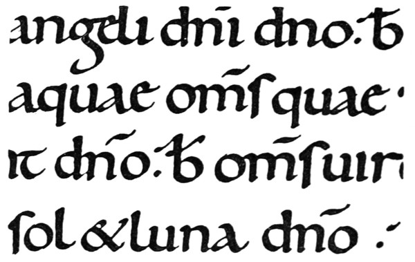
Fig. 12.—Psalter: English tenth century.
(See also Plate VIII.)
THIRTEENTH, FOURTEENTH, AND FIFTEENTH CENTURY WRITING.—The tendency to compression continued, and a further economy of space was effected in the thirteenth and fourteenth centuries by the general use of much smaller writing (see fig. 13). In the fifteenth century writing grew larger and taller again, but the letters had steadily become [p047] narrower, more angular, and stiffer, till the written page consisted of rows of perpendicular thick strokes with heads and feet connected by oblique hair-lines—which often look as if they had been dashed in after with a fine pen—all made with an almost mechanical precision (see Plate XVII.).
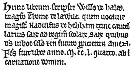
Fig. 13.—Colophon of English MS., dated 1254.
ITALIAN WRITING.—In Italy alone the roundness of the earlier hands was preserved, and though in course of time the letters were affected by the “Gothic” tendency, they never lost the curved forms or acquired the extreme angularity which is seen in the writings of Northern Europe (compare Plates X. and XI.).
At the time of the Renaissance the Italian scribes remodelled their “hands” on the beautiful Italian writing of the eleventh and twelfth centuries (see Plates X. and XVIII., XIX., XX.). The early Italian printers followed after the scribes and modelled their types on these round clear letters. And thus the fifteenth century Italian formal writing became the foundation of the “Roman” small letters, which have superseded all others for the printing of books. [p048]
ITALICS.—The Roman Letters, together with the cursive hand of the time, gave rise to “Italic” letters (see fig. 1, & pp. 311, 316, 483).
ORNAMENTAL LETTERS originated in the simple written forms, which were developed for special purposes, and were made larger or written in colour (see Versals, &c., fig. 1, 189).
Their first object was to mark important words, or the beginnings of verses, chapters, or books. As Initial Letters they were much modified and embellished, and so gave rise to the art of Illumination (see pp. 113, 114).
CHAPTER II ACQUIRING A FORMAL HAND: (1) TOOLS Acquiring a Formal Hand: Tools, &c. — The Desk — Paper & Ink — Pens: The Reed: The Quill — Of Quills generally — Pen-knife, Cutting-slab, &c.
ACQUIRING A FORMAL HAND: TOOLS, &C.
The simplest way of learning how to make letters is to acquire a fine formal hand. To this end a legible and beautiful writing (see p. 70) should be chosen, and be carefully copied with a properly cut pen.
For learning to write, the following tools and materials are required:—
- Desk.
- Writing-paper.
- Ink and filler.
- Pens (Reed and Quill) with “springs.” [p049]
- Pen-knife, sharpening-stone, and cutting-slab.
- Magnifying glass.
- Two-foot (preferably three-foot) rule, and pencil.
- Linen pen-wiper.
THE DESK
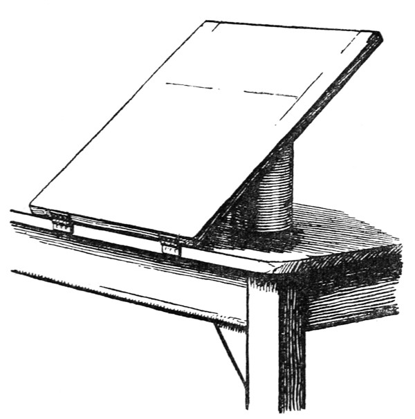
Fig. 14.
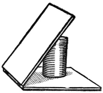
Fig. 15.
An ordinary desk or drawing-board can be used, but the best desk is made by hinging a drawing-board (“Imperial” size) to the edge of a table. The board may be raised and supported at any desired angle by a hinged support, or by a round tin set under it (fig. 14). For a more portable [p050] desk two drawing-boards may be similarly hinged together and placed on a table (fig. 15).
Fig. 16.
A tape or string is tightly stretched—horizontally—across the desk to hold the writing-paper (which, as a rule, is not pinned on). The lower part of the writing-paper is held and protected by a piece of stout paper or vellum fixed tightly, with drawing-pins, across and over it (fig. 16). Under the writing-paper there should be a “writing-pad,” consisting of one or two [p051] sheets of blotting-paper, or some other suitable substance.10
It is a good plan to have the lower, front edge of the desk bevelled or rounded, so that the tail part of a deep sheet, which may hang below the table, does not become accidentally creased by being pressed against it. A curved piece of cardboard fixed on the edge will answer the same purpose.
PAPER & INK
For “practice” any smooth—not glazed—paper will do. For careful work a smooth hand-made paper is best (pp. 103, 111).
A good, prepared, liquid (carbon) ink is best. It should be as black as possible, without being too thick. A jet-black ink will test the quality of the writing by “showing up” all the faults; “pale” or “tinted” inks rather conceal the faults, and lend a false appearance of excellence (p. 322). A thin ink greatly adds to the ease of writing (see Addenda, p. 23). Waterproof inks, as a rule, are too thick or gummy, and do not flow freely enough.
The ink-bottle is kept corked when not in use, to keep the ink clean and prevent evaporation. Thick or muddy ink should be put away: it is not worth while trying to use it.
A small brush is used for filling the pen.
PENS
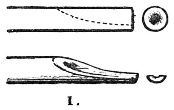
Fig. 17.
A Reed or Cane pen is best for very large writing—over half an inch in height—and therefore [p052] it is of great use in studying pen strokes and forms.
A Quill is best for smaller writing, and is used for all ordinary MS. work (pp. 54–60).
The REED11 pen should be about 8 inches long.
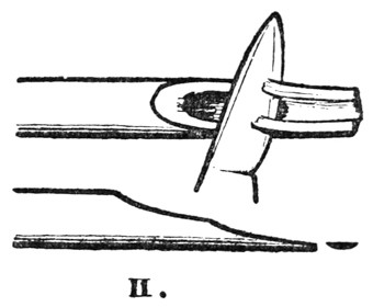
Fig. 18.
I. One end is cut off obliquely (fig. 17).
II. The soft inside part is shaved away by means of a knife laid flat against it, leaving the hard outer shell (fig. 18).

Fig. 19.
III. The nib is laid, back up, on the slab (p. 61), and—the knife-blade being vertical—the tip is cut off at right angles to the shaft (fig. 19).
IV. A short longitudinal slit (a–b) is made by [p053] inserting the knife-blade in the middle of the tip (fig. 20).
V. A pencil or brush-handle is held under the nib, and is gently twitched upwards to lengthen the slit (fig. 21). An ordinary reed should have a slit about 34 inch long. A very stiff pen may have in addition a slit on either side of the centre.
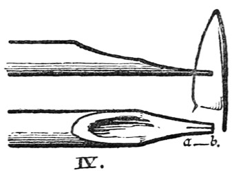
Fig. 20.
The left thumb nail is pressed against the back of the pen—about 1 inch from the tip—to prevent it splitting too far up (see also fig. 27).
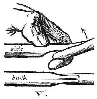
Fig. 21.
VI. The nib is laid, back up, on the slab, and—the knife-blade being vertical—the tip is cut off at an angle of about 70° to the shaft, removing the first rough slit a–b (fig. 22). [p054]
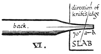
Fig. 22.
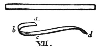
Fig. 23.
VII. A strip of thin metal (very thin tin, or clock spring with the “temper” taken out by heating and slowly cooling) is cut the width of the nib and about 2 inches long. This is folded into a “spring” (fig. 23).
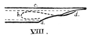
Fig. 24.
VIII. The spring is inserted into the pen (fig. 24).
The loop a b c is “sprung” into place, and holds the spring in the right position. The loop c d, which should be rather flat, holds the ink in the pen. The point d should be about 18 inch from the end of the nib.
THE QUILL.—A Turkey’s Quill is strong, and suitable for general writing. As supplied by the stationers it consists of a complete wing-feather, about 12 inches long, having the quill part cut for ordinary use. For careful writing it should be re-made thus:—
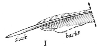
Fig. 25.
I. The quill should be cut down to 7 or 8 inches (fig. 25); the long feather if left is apt to be in the way.
II. The “barbs” or filaments of the feather are stripped off the shaft (fig. 26). [p055]
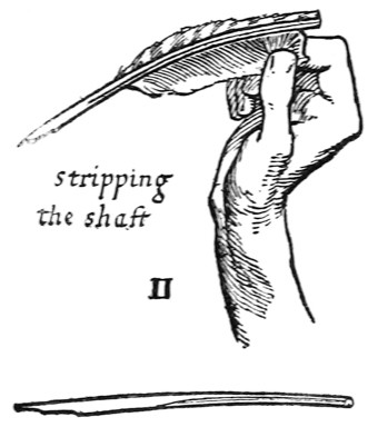
Fig. 26.
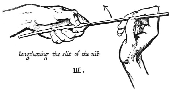
Fig. 27.
III. The nib already has a slit usually about 14 inch long. This is sufficient in a fairly pliant pen; in a very stiff pen (see p. 60) the slit may be lengthened to 38 inch. This may be done with care by holding a half-nib between the forefinger [p056] and thumb of each hand, but the safest way is to twitch the slit open (fig. 27), using the end of another pen (or a brush-handle) as explained under Reed, V. (see p. 53).
IV. The sides of the nib are pared till the width across the tip is rather less than the width desired12 (fig. 28).
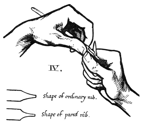
Fig. 28.
V. The nib is laid, back up, on the glass slab, and the extreme tip is cut off obliquely to the slit, the knife blade being slightly sloped, and its edge forming an angle of about 70° with the line of the shaft (fig. 29; see also fig. 36). [p057]
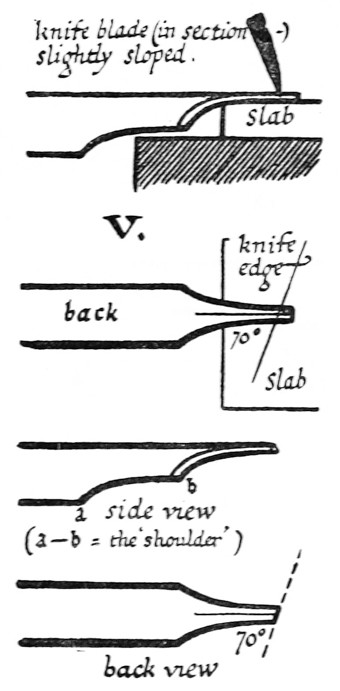
Fig. 29.
The shaft rests lightly in the left hand (not gripped and not pressed down on slab at all), and the knife blade is entered with a steady pressure.
If the nib is then not wide enough it may be cut again; if too wide, the sides may be pared down.
Cut very little at a time off the tip of the nib; a heavy cut is apt to force the pen out of shape and spoil the edge of the nib.
VI. The nib should then be examined with the magnifying glass. Hold the pen, back down, over a sheet of white paper, and see that the ends of the two half-nibs are in the same straight line a–b (fig. 30).
The nib should have an oblique chisel-shaped tip, very sharply cut (fig. 31).
A magnifying glass is necessary for examining a fine pen; a coarse pen may be held up against [p058] the light from a window—a finger-tip being held just over the nib to direct the eye (fig. 32).
Fig. 1.
5 “The alphabet which we use at the present day has been traced back, in all its essential forms, to the ancient hieratic writing of Egypt of about the twenty-fifth century before Christ. It is directly derived from the Roman alphabet; the Roman, from a local form of the Greek; the Greek, from the Phœnician; the Phœnician, from the Egyptian hieratic. . . . We may without exaggeration . . . carry back the invention of Egyptian writing to six or seven thousand years before Christ.”—Sir Edward Maunde Thompson, “Greek and Latin Palæography,” pp. 1–2.
Fig. 2.
[p038]
6 Ibid., p. 196.
7 “G. & L. Palæography,” p. 204. (Minuscules = “small letters.” Half-Uncials are sometimes distinguished, as “round minuscules”—p. 302.)
Fig. 3.
Fig. 4.—Æneid, on vellum, third or fourth century.
[p297]
Fig. 5.—Psalter, fifth century.
8 It is possible that their forms were influenced by the use of the brush in painting up public notices and the like. The introduction of the use of vellum—a perfect writing material—in the making of books, led to such a great advance in the formality and finish of the book-hands (especially of the Uncial character) that, practically, it may be said to mark the beginning of penmanship as a “fine” art. This change may be assigned to any time between the first and the third centuries (palæographical dates before the fifth century must generally be regarded as approximate).
[p300]
Fig. 6.—S. Augustine: probably French sixth century.
Fig. 7.—“Durham Book”: Lindisfarne, about A.D. 700.
(See also Plate VII.)
9 “Greek and Latin Palæography,” p. 233.
Fig. 171.—Part of fig. 8, enlarged three times linear (see p. 305).
[p305]
Fig. 8.—British Museum: Harl. MS. 2790. Caroline MS. first half of 9th century. (See also fig. 171 & p. 305.)
Fig. 9.
Fig. 10.
Fig. 11.
Fig. 12.—Psalter: English tenth century.
(See also Plate VIII.)
Fig. 13.—Colophon of English MS., dated 1254.
[p311]
Fig. 178.—Part of Plate XXI., enlarged, (approx.) four times linear (see p. 483).
[p483]
Fig. 189.—(See also Plates VI., XI., XXII., figs. 79 and 84, and p. 420.)
[p113]
[p114]
[p070]
Fig. 14.
Fig. 15.
Fig. 16.
10 Some Eastern scribes use a “pad” of fur. This, or a piece of springy cloth, or other elastic substance, would probably be helpful, and experiments should be made in this direction.
[p103]
[p111]
[p322]
ADDENDA & CORRIGENDA
[p054]
[p060]
11 The ordinary “Reed pen” of the artists’ colourman is rather soft and weak for formal writing. The reeds used by the native scribes in India and Egypt, and some of the harder English reeds, are excellent. A fine, hollow cane also makes a very good pen.
Fig. 17.
Fig. 18.
[p061]
Fig. 19.
Fig. 20.
Fig. 21.
Fig. 27.
Fig. 22.
Fig. 23.
Fig. 24.
Fig. 25.
Fig. 26.
[p053]
12 The width of the cut nib corresponds exactly with the width of the thickest stroke which the pen will make in writing.
Fig. 28.
Fig. 29.
Fig. 36.
Fig. 30.
Fig. 31.
Fig. 32.
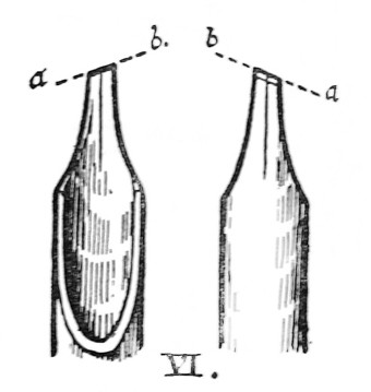
Fig. 30.
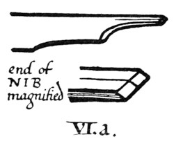
Fig. 31.
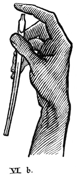
Fig. 32.

Fig. 33.
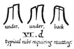
Fig. 34.
A nib in which the slit does not quite close may be bent down to bring the two parts together (fig. 33). [p059]
Uneven or blunt nibs (fig. 34) must be carefully re-cut.

Fig. 35.
VII. The Spring (see Reed, VII.) (about 332 inch by 112 inch) is placed so that the point is about 116 inch from the end of the nib. The long loop should be made rather flat to hold plenty of ink (A, fig. 35)—neither too much curved (B: this holds only a drop), nor quite flat (C: this draws the ink up and away from the nib).
OF QUILLS GENERALLY
For ordinary use the nib may be cut with a fairly steep angle, as shown (magnified) at (a) (fig. 36).
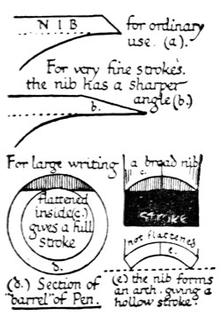
Fig. 36.
But it is better for fine, sharp writing that the angle be made very sharp: the knife blade is laid back (much flatter than is shown in fig. 29) and the quill is cut quite thin; the knife blade is then held vertical and the extreme tip of the nib is cut off sharp and true (b, fig. 36).
For large writing, the curved inside of the quill is pared flat (c, d, fig. 36) [p060] to give full strokes. If the nib be left curved and hollow underneath (e), it is apt to make hollow strokes.
The pen may be made more pliant by scraping it till it is thinner, or by cutting the “shoulder” (a–b, fig. 29) longer, or stiffer by cutting the nib back until the “shoulder” is short.
Goose and Crow Quills (see p. 172).
The main advantages of a quill over a metal pen are, that the former may be shaped exactly as the writer desires, and be re-cut when it becomes blunt.
A metal pen may be sharpened on an oilstone, but the process takes so much longer that there is no saving in time: it is not easily cut to the exact shape, and it lacks the pleasant elasticity of the quill.
A gold pen is probably the best substitute for a quill, and if it were possible to have a sharp, “chisel-edged” iridium tip on the gold nib, it would be an extremely convenient form of pen. A “fountain pen” might be used with thin ink.
PEN-KNIFE, CUTTING-SLAB, &C.

Fig. 37.
THE KNIFE.—Quill makers use a special knife. A surgical scalpel makes an excellent pen-knife. The blade should be fairly stout, as the edge of a thin blade is easily damaged. It should be ground almost entirely on the right side of the blade (fig. 37) and kept very sharp. [p061]
THE SLAB.—A piece of glass (preferably white) may be used for fine quills; hard wood, bone, or celluloid for reed and cane pens.
SHARPENING STONE.—A “Turkey” (fine) or “Washita” (fine or coarse grained) stone.
MAGNIFYING GLASS.—A magnifying glass (about 1 inch in diameter) is necessary for examining fine pen nibs to see if they are “true.” A “pocket” glass is the most suitable for general use, and for the analysis of small writing, &c.
RULE.—A 2, or 3-foot wood rule having brass strips let in to protect the edges, or a metal rule.
LINEN PEN-WIPER.—A piece of an old linen handkerchief may be used to keep the pen clean.
CHAPTER III ACQUIRING A FORMAL HAND: (2) METHODS Position of the Desk — The Writing Level — Use of the Pen — Holding the Pen — Filling the Pen, &c.
POSITION OF THE DESK
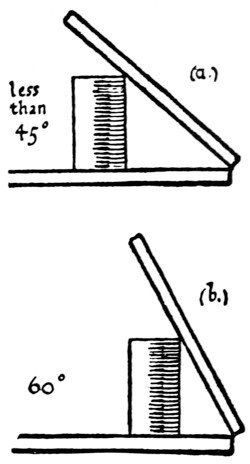
Fig. 38.
Always write at a slope. This enables you to sit up comfortably at your work, and to see the MS. clearly as though it were on an easel—and, by the resulting horizontal position of the pen, the ink is kept under control. It may be seen from ancient pictures that this was the method of the scribes (see Frontispiece). Never write on a flat table; it causes the writer to stoop, the MS. is seen foreshortened, and the ink flows out of the pen too rapidly. [p062]
The slope of the desk may be about, or rather less than, 45° to begin with: as the hand becomes accustomed to it, it may be raised to about 60° (fig. 38).
The “heel” of the right hand may be tired at first, but it soon grows used to the position. A rest for the left arm, if necessary, can be attached to the left side of the board.
Lighting. The desk is placed very near to a window, so that a strong light falls on it from the left. Direct sunlight may be cut off by fixing a sheet of thin white paper in the window. Careful work should be done by daylight. Work done by artificial light always appears faulty and unsatisfactory when viewed by day.
THE WRITING LEVEL
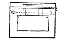
Fig. 39.
Each penman will find for himself the writing level along which his pen will move most naturally and conveniently (see figs. 39 and 16). The paper guard should be pinned on about 1 inch below the [p063] writing level: the tape is fixed across about 3 inches above the guard. In the case of very large writing the space between the tape and the guard is greater, and in the case of a very small MS. it is less.
The writing level is kept constant. When one line has been written, the writing paper—which is placed behind the tape and the guard—is pulled up for another line.
USE OF THE PEN
For the practical study of pen-forms use a cane or a reed pen—or a quill cut very broad—giving a broad, firm, thick stroke. It is the chisel edge (p. 57) of the nib which gives the “clean cut” thick and thin strokes and the graduated curved strokes characteristic of good writing (fig. 40).
Fig. 40.
Therefore, let the nib glide about on the surface with the least possible pressure, making natural pen-strokes the thickness of which is only varied [p064] by the different directions in which the nib moves (see Addenda, p. 23).
It is very important that the nib be cut “sharp,” and as often as its edge wears blunt it must be resharpened. It is impossible to make “clean cut” strokes with a blunt pen (see Addenda, p. 25).
When the nib is cut back, the “shoulder” should be cut back to preserve the elasticity of the pen (p. 60).
HOLDING THE PEN
The hand holds the pen lightly and easily. A good method is to loop the thumb and forefinger over, and slightly gripping, the shaft of the pen, and support the shaft from below with the second finger. The third and fourth fingers are tucked, out of the way, into the palm (figs. 41, 45).
The pen should be so lightly held that the act of writing should draw the edge of the nib into perfect contact with the paper, both the half-nibs touching the surface. (To make sure that the contact is perfect, make experimental thick strokes on a scrap of paper—pinned at the right-hand side of the desk—and see that they are “true,” i.e. that they are of even width, with “clean cut” edges and ends.) The writer should be able to feel what the nib is doing. If the pen be gripped stiffly the edge of the nib cannot be felt on the paper; and it will inevitably be forced out of shape and prematurely blunted.
A thin slip of bone—a “folder” or the handle of the pen-knife will do—is commonly held in the left hand to keep the paper flat and steady (see fig. 41). [p065]
THE CUSTOMARY MANNER.—The ancient scribe probably held his pen in the manner most convenient to himself; and we, in order to write with freedom, should hold the pen in the way to which, by long use, we have been accustomed; provided that, for writing an upright round-hand, the pen be so manipulated and cut as to make fine horizontal thin strokes and clean vertical thick strokes (see fig. 40, & footnote, p. 304).
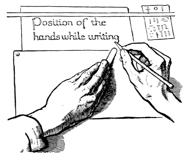
Fig. 41.
SLANTED SHAFT, &c.—Most people are accustomed to holding a pen slanted away from the right shoulder. The nib therefore is cut at [p066] an oblique angle13 to the shaft, so that, while the shaft is slanted, the edge of the nib is parallel with the horizontal line of the paper, and will therefore produce a horizontal thin stroke and a vertical thick stroke. For example: if the shaft is held slanted at an angle of 70° with the horizontal, the nib is cut at an angle of 70° with the shaft (fig. 42). The angle of the nib with the shaft may vary from 90° (at right angles) to about 70°, according to the slant at which the shaft is held (fig. 43).
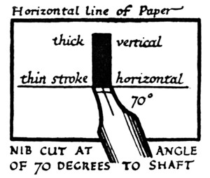
Fig. 42.
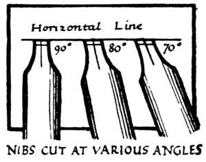
Fig. 43.
If the writer prefers an extremely slanted shaft, to cut the nib correspondingly obliquely would weaken it, so it is better to counteract the slant by slightly tilting the paper (fig. 44).
To produce the horizontal thin stroke, therefore:
- The slant at which the shaft is held,
- The angle at which the nib is cut, and
- The tilt which may be given to the paper:
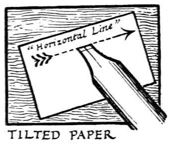
Fig. 44.
must be so adjusted, one to another, that the chisel edge of the nib is parallel to the horizontal line of the paper. Before writing, make trial strokes on a scrap of paper to see that this is so: the vertical thick strokes should be square ended and the full width of the nib, the horizontal strokes as fine as possible.
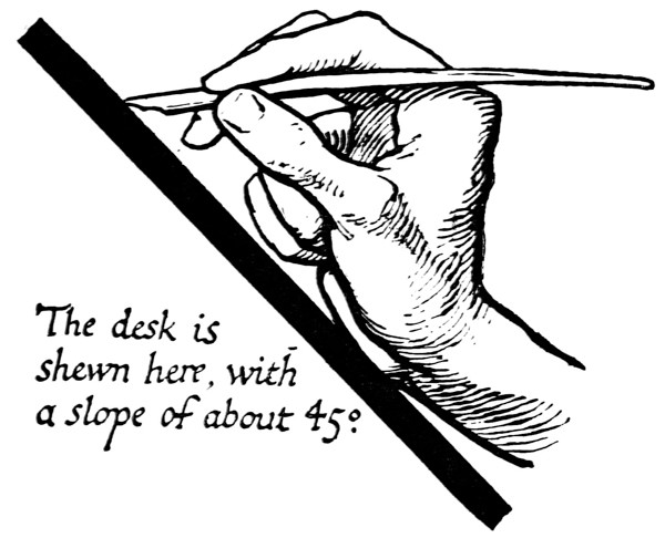
Fig. 45.
HORIZONTAL SHAFT, &c.—The pen shaft is held approximately horizontal. This will be found the natural position for it when the slope [p068] of the desk is about 50° or 60°. It gives complete control of the ink in the pen, which can be made to run faster or slower by slightly elevating or depressing the shaft (fig. 45).
The writing-board may be slightly lowered or raised with the object of elevating or depressing the pen shaft (fig. 46 & p. 118).
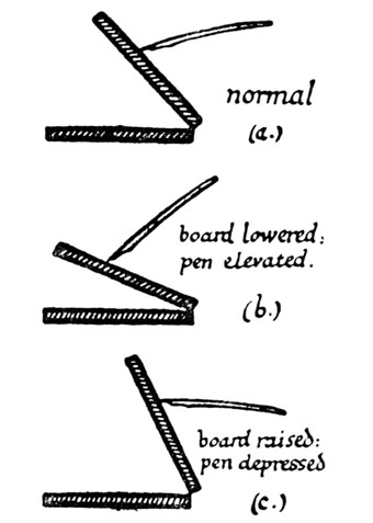
Fig. 46.
The pen makes a considerable angle with the writing surface, so that the ink, which is held in the hollow of the nib, comes in contact with the paper at the very extremity of the nib, making very fine strokes (a, fig. 47).
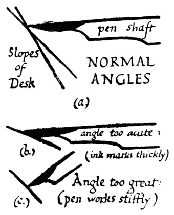
Fig. 47.
The spring is adjusted carefully, the tip being approximately 116 inch from the tip of the nib. The nearer the spring is to the end of the nib, the faster the ink flows. The loop must be kept flattish in order to hold the ink well (see fig. 35). [p069]
It is convenient to stand the ink, &c., beside the desk on the left, and for this purpose a little cup-shaped bracket or clip may be attached to the edge of the writing-board. The filling-brush stands in the ink-bottle (p. 51) or pot of colour (p. 176), and is taken up in the left hand; the pen, retained in the right hand, being brought over to the left to be filled.
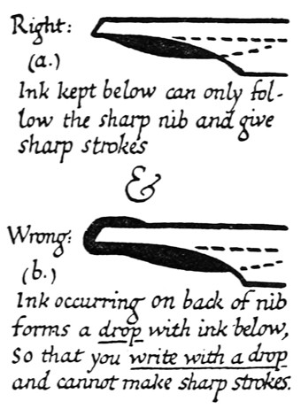
Fig. 48.
The back of the nib is kept dry (a, fig. 48). A very convenient and perfectly clean method, when care is taken, of removing any ink on the back of the pen is to draw it across the back of the left fore-finger.
In careful work the pen should be tried, on a [p070] scrap of paper, almost every time it is filled (to see that it is not too full and that the ink is flowing rightly).
The nib is kept clean. A carbon ink (p. 51), through gradual evaporation, is apt to clog the nib (especially in hot weather); therefore every now and then, while the nib is in use, the spring is taken out and the whole thoroughly cleaned. It is impossible to write well with a dirty pen.
CHAPTER IV ACQUIRING A FORMAL HAND: (3) MODELS Models — Notes on Construction: Script I. — Coupling the Letters — Spacing: Letters, Words, & Lines — Uncial Capitals: Script II. — Numerals & Punctuation Marks — Of Copying MSS. Generally.
MODELS
The best training is found in the practice of an upright round-hand (p. 302). Having mastered such a writing, the penman can acquire any other hands—sloping or angular—with comparative ease (p. 323).
The English Half-Uncial writing in Plate VII. is an excellent model. Those who have sufficient time to spare for the careful study of this, or any other legible and beautiful round-hand, should obtain access to the MSS. in a museum, or procure good facsimiles (see Plates at end of Book, & p. 388).
Those who have not sufficient time for a careful and thorough study of an early MS. will find it [p071] easier to begin with a simplified and modernised writing, such as Script I. (fig. 49).
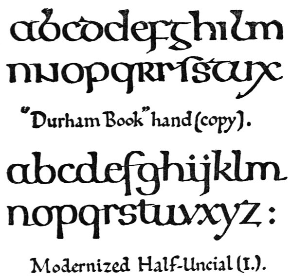
Fig. 49.
Before copying a hand it is well to examine carefully the manuscript from which it is taken: observe its general appearance: note the character and mode of the ruling, and the sizes and relative proportions of page, text, margins, and ornaments. With regard to the actual forms of the letters and the mode of their arrangement, such a method of analysis as the following will be found useful, as an aid to accuracy in copying, and definiteness in self-criticism. [p072]
Fig. 33.
Fig. 34.
Fig. 35.
Fig. 36.
Fig. 29.
[p172]
Fig. 37.
Fig. 38.
Fig. 39.
Fig. 16.
[p057]
Fig. 40.
ADDENDA & CORRIGENDA
[p-xv]
[p060]
Fig. 41.
Fig. 45.
[p304]
13 If the edge of the nib were cut at right angles to the shaft, obviously the horizontal stroke would not be thin, and the true thick and thin strokes would be oblique (see “slanted pen” writing—fig. 9 & 11).
Fig. 42.
Fig. 43.
Fig. 44.
Fig. 46.
NOTES ON CONSTRUCTION OF VERSALS
(See figs. 80, 81, 85, 165)
Fig. 47.
[p051]
[p176]
Fig. 48.
[p302]
[p323]
[p388]
Fig. 49.
A METHOD OF ANALYSIS.
Example: Analysis of Script I.
(as in fig.
50).
1. THE WRITING
general character:
Modernized Half-Uncial.
(Ruling)
Double or single lines, &c. (see pp.
304,
305):
Double lines(
see figs. 59,
65).
Letters
round or angular:
round.upright or sloping:
upright.coupled or separate:
coupled.2. THIN STROKES:
horizontal or oblique (see figs.
10,
9):
horizontal.3. THICK STROKES:
heavy, medium, or light (see fig.
183):
medium.4. “HEADS” & “FEET”:
character (see fig.
145):
solid, triangular, &c.5. STEMS (
ascending&
descending):
short, medium, or long (see fig.
183):
medium.6. SPACING (
Letters, Words, Lines):
close or wide (see fig.
154):
fairly close(
see figs. 54,
55).
7. ARRANGEMENT:
in mass (of equal lines), or in column (of unequal lines) (see fig.
154):
in mass of equal lines(
see fig. 66).
8. MEASUREMENTS (&
proportions see pp. 324,
327):
width of thick stroke (see p.
83):
l = about 332″ wide.height of
oand
d(see pp.
82,
84):
- o = about 38″ high.
- d = about 1116″ high.
writing lines, distance apart (see p.
82):
Lines 1″ apart.9. COMPONENT PARTS:
number and forms (see pp.
75,
81,
84):
- a has 3 strokes.
- b has 3 strokes.
- c has 2 strokes.
- and so on (see fig. 51).
[p073]
The pen generally is held so as to give approximately horizontal thin strokes (see p. 66), but in making v (w, y) and x, parts of z, &c., it is “slanted.” In figs. 51 and 57 these forms are marked with a small diagonal cross × (see also p. 25).
Most of the strokes begin as down-strokes, but at the end of a down-stroke, when the ink is flowing freely, the stroke may be continued in an upward direction (as in coupling-strokes, &c., the feet of letters, the thin stroke of x, and, if preferred, in making the last stroke of g, s, and y).
While the ink is still wet in a down-stroke, the nib may be replaced on it and be pushed upward and outward to form the round arch in b, h, m, n, p, and r. This stroke, reversed, is also used for the top of t.
The making of these UP-strokes is shown diagrammatically in fig. 51.
Note.—The forms +oin× in fig. 51 contain all the principal strokes in this alphabet, and are therefore useful for early practice.
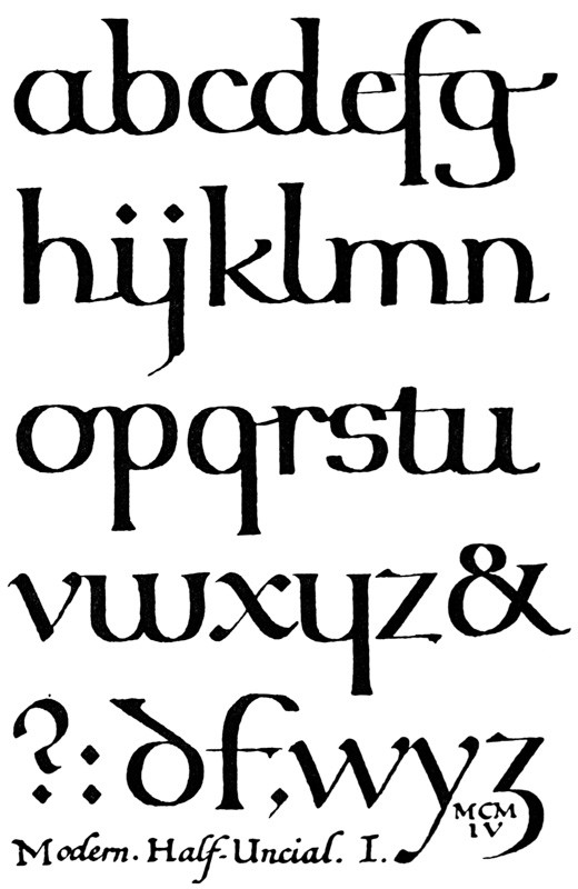
Fig. 50.

Fig. 51.
COUPLING THE LETTERS
The letters are joined together by means of their coupling-strokes, which for this purpose may be slightly drawn out, and forward, from the naturally round forms of the letters (see c, e, &c., fig. 52 & fig. 59).
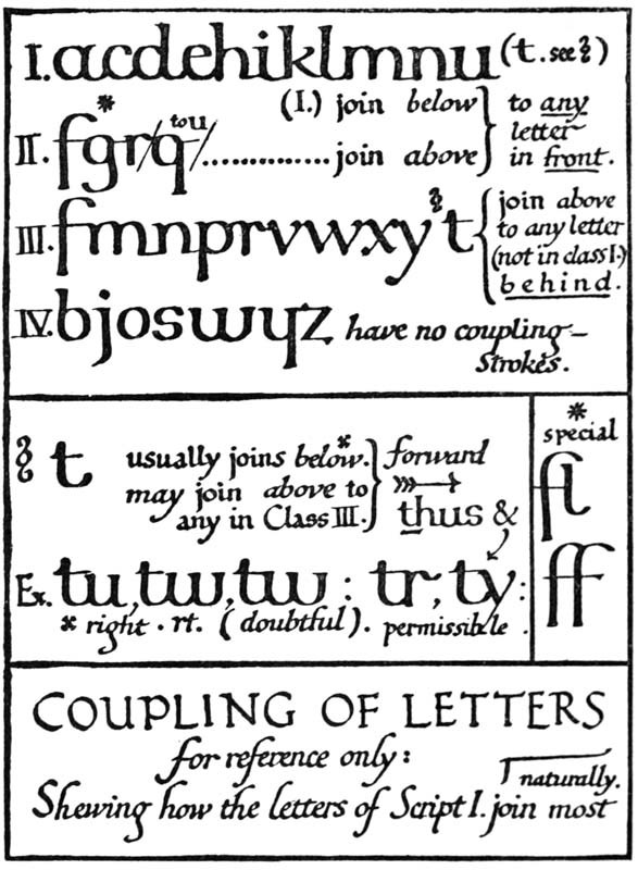
Fig. 52.
The coupling-strokes are finishing strokes—and as such are akin to serifs (p. 244)—growing out of or added to such stems as need “finishing.”
Coupling enables one to write faster and with [p076] more freedom, the concluding or “coupling” stroke not being slowed down, but written with a dash, which is covered by the first stroke of the succeeding [p077] letter. It keeps the individual words more distinct, and therefore permits closer spacing of the text. Coupling is for convenience and legibility, and where it tends to interfere with legibility, we must be careful. The freer and more cursive the hand, the greater is the tendency to join and run letters together, as in ordinary writing.
It is preferable to couple letters below, if possible. Couplings above are sometimes apt to confuse the reading; for example, the cross-bar of t (though the most natural coupling for the scribe to use—see petatis, Plate VII.) should generally be made to pass over or fall short of the succeeding letter (see fig. 52).
SPACING: LETTERS, WORDS, & LINES
The letters of a word are fitted together so that there is a general effect of evenness. This evenness is only to be attained by practice: it is characteristic of rapid skilful writing, and cannot be produced satisfactorily by any system of measurement while the writer’s hand is still slow and uncertain. It is worth noting, however, that the white interspaces vary slightly, while the actual distances between the letters vary considerably, according to whether the adjacent strokes curve (or slant) away or are perpendicular (figs. 53, 152).
It is sufficient for the beginner to take care that two curved letters are made very near each other, and that two straight strokes are spaced well apart.
If the curves are too far apart there will be spots of light, and where several heavy stems are made too close together, “blots” of dark, marring the evenness of the page. [p078]
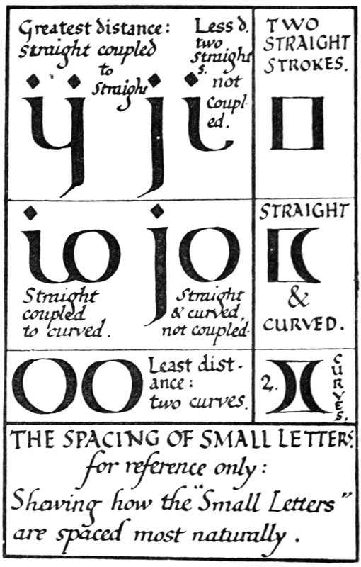
Fig. 53.
Words are kept as close as is compatible with legibility. The average space between two words is the width of the letter o (fig. 54). [p079]
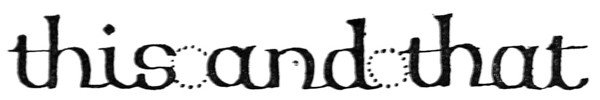
Fig. 54.
The Lines in massed writing (see p. 262) are kept as close together as is compatible with legibility. The usual distance apart of the writing-lines is about three times the height of the letter o (see also p. 327).
The descending strokes of the upper line must “clear” the ascending strokes of the lower line. Interlocking of these strokes may be avoided by the experimental placing of p over d (fig. 55).
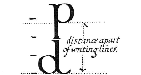
Fig. 55.
UNCIAL CAPITALS: SCRIPT II.
These modernised Uncials (see fig. 56, & p. 300) are intended to go with Script I., and their analysis and mode of construction are almost identical with those of Script I. (see pp. 72, 73). [p082]
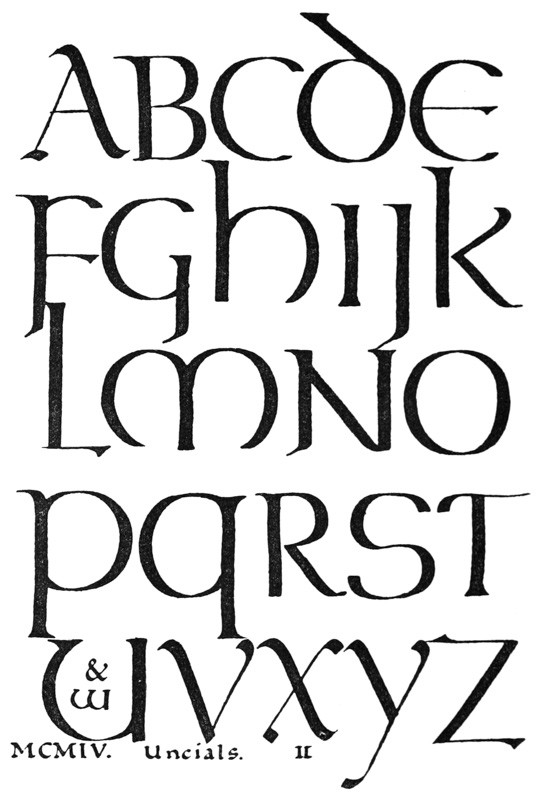
Fig. 56.
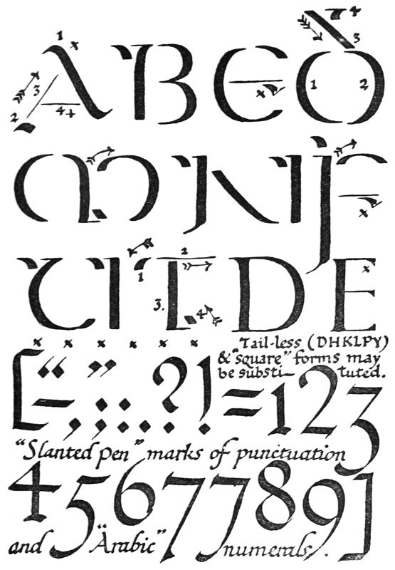
Fig. 57.
Grouping: Uncials have no coupling-strokes; when several are used together, they are not joined, but evenly grouped, allowing as before for curves and straight strokes (see p. 77).
-
Spacing:
- (a) When used with Script I., Uncials are written on the same lines, and have to follow the same spacing (in spite of their longer stems).
- (b) When Uncials are used by themselves, their spacing may be wider (p. 297).
Note.—The height of Uncial o is about equal to the height of the Half-Uncial d.
NUMERALS & PUNCTUATION MARKS
(See fig. 57.)
These are best made with a “slanted” pen (fig. 9).
When writing “Arabic numerals,” 1 and 0 may be made on the line, 2468 ascending, and 3579 descending.
OF COPYING MSS. GENERALLY
When copying a MS. it is best to choose a complete page—or part of a page—to be copied in facsimile.
Two or three lines are copied to begin with; then the composition of the individual letters and words is studied by means of a large pen; and finally the whole page is copied in facsimile. (Of practising, see pp. 85, 86).
Make a general examination and analysis as suggested at p. 71. Accurate measurements will be found helpful.
Take the heights of the o and the d, and the distance apart of the writing-lines with dividers [p083] The width of the thick stroke is best found by making experimental thick strokes—the full width of the pen nib—on a scrap of paper: cut the paper in half across the thick strokes, and place the cut edge on the thickest strokes in the original MS., you will then find whether the pen nib should be cut wider or narrower.
The direction of the thickest strokes is approximately at right angles to the direction of the thin strokes; which commonly approaches the horizontal in early round hands, and is oblique in other hands (see fig. 9 and 10). The positions both of these strokes in the model, and of your pen, determine the angle of the nib. Therefore, cut the nib across at such an angle to the shaft of the pen that, when you hold the pen naturally, the direction of the thin strokes which it makes on the writing paper will coincide with the direction of the thin strokes in the model; but
- (a) The way in which the shaft is held,
- (b) The angle at which the nib is cut,
- (c) The position of the writing paper,
may all be slightly varied, so that the direction of the thin strokes can be followed exactly (see p. 66).
The writing paper is cut and ruled exactly in accordance with the model; and the heights of the letters and the widths of the thick strokes in the copy agree as nearly as possible with those in the original. It is therefore a good test for accuracy—when a few lines of writing have been copied—to measure and compare their lengths. If they correspond with their originals, it goes far to prove the copy a good one.
Before copying more of the page, the construction of the letters should be carefully studied. The number and the forms of pen-strokes in each letter [p084] are found by examination—with a magnifying glass if necessary—and by the experimental putting together of strokes, to form a similar letter. For this a large pen, such as a reed, is useful, and it is a good plan to write individual letters and words exactly two, three, or four times their height in the model: both the pen nib and the individual letters are made correspondingly two, three, or four times as wide as in the original.
It is particularly important, in copying, to preserve accurately the proportion of the thick stroke to the height and width of a letter (see p. 324). These are conveniently measured by the pen nib itself, or by the estimated width of the thick stroke; thus, in the writing shown in fig. 50, the width of the o is approximately five, and the height approximately four, times the width of the thick stroke.
Not only must the copier ascertain what the forms are like and what are their proportions, but he must try to find out how they were made. This is of the greatest importance, for the manner of making a letter, or even a single stroke, affects its form and character with a definite tendency (see p. 416 & fig. 172). And this becomes more marked the faster the writing. An apparently right form may yet be wrongly—if slowly—made; but in rapid writing, a wrong manner of handling the pen will inevitably produce wrong forms. As the real virtue of penmanship is attained only when we can write quickly, it is well worth training the hand from the beginning in the proper manner.
Patient and careful examination should be made of the changing pen-strokes, and of the mode in which they join—to form letters—and begin and end—to form “heads” and “feet.” This, accompanied [p085] by practical experiments in cutting and handling the pen, will bring out details of the utmost technical value. A certain amount of legitimate “faking” (p. 246), play of the pen, and sleight of hand (p. 311), may be found, but, in the main, the regular, natural, thick and thin strokes of the pen, and the orderly arrangement of the writing, give to a manuscript its beauty and character.
Then having cut the nib rightly, you may, in a sense, let the pen do the writing, while you merely follow the strokes of the model, and you will, in course of time, have the pleasure of seeing the same beautiful writing—in the very manner of the ancient scribes—growing under your own hand.
CHAPTER V ACQUIRING A FORMAL HAND: (4) PRACTICE Practice — Scripts I. & II. — Arranging & Ruling a Single Sheet — Problem I. (a Sheet of Prose) — Problem II. (a Sheet of Poetry) — Spacing & Planning Manuscript.
PRACTICE
In acquiring a formal writing the penman should have two paper books constantly in hand: one for the study of the forms of letters, the other for both the letters and their arrangement. The first should contain large and very carefully made writing—with perhaps only one word to the line; the second [p086] should have smaller and quicker writing, neatly arranged on the pages, with four or five words to the line. (See MS. Books, Chap. VI.)
A broad nib is used in preference to a narrow one, so that the characteristics of true pen-work are brought out and the faults made clear. A fine, light handwriting is often very pretty, but it is certain to mislead the novice in penmanship (see p. 324).
Having acquired a formal hand the penman may modify and alter it, taking care that the changes are compatible, and that they do not impair its legibility or beauty. Such letters as are obsolete he replaces by legible forms akin to them in feeling, and, the style of the selected type becoming very naturally and almost unconsciously modified by personal use, he at length attains an appropriate and modern Formal-Handwriting. The process of “forming” a hand requires time and practice: it resembles the passage of “Copy-book” into “Running” hand, familiar to us all (see p. 323).
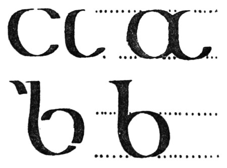
Fig. 58.
SCRIPTS I. & II.
Having cut the nib of a reed or large quill to the exact width required for the thick stroke, copy the component strokes of the letter

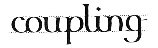
Fig. 59.

Fig. 60.
Script II. is similarly practised: the letters are grouped (p. 82) to form words (fig. 60).
Next make a neat page of large writing, and, if possible, write such a page every day. The more definite and methodical practice is, the better. “Practising” anyhow, on scraps of paper, does more harm than good.
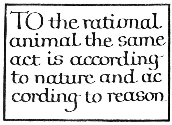
Fig. 61.
ARRANGING & RULING A SINGLE SHEET
The size of an inscription is commonly settled before the arrangement of the text is planned out, being determined by considerations of its future position and office, or by custom and use (see pp. 100–103 & 351). [p089]
The proportions of the writing, spacing, and margins will likewise properly settle themselves (see pp. 265, 103, 107), but where the size of the sheet only is fixed, we have, broadly speaking, to decide between “large” writing with “small” margins (fig. 61), and “small” writing with “large” margins (fig. 62).
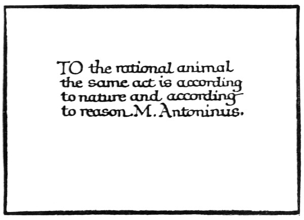
Fig. 62.
Generally a compromise is arrived at and the proportions are more evenly balanced (fig. 63).
Ruling (see also pp. 258, 99).—The mode of ruling marginal lines and writing lines is shown in fig. 65. The ruling should be light, but firm and accurate. A fine pen, or hard pencil, or a blunt point may be used. Where the writing lines are double (as for round hands, p. 304), it is best to have a double ruling point (see fig. 77). Two hard pencils firmly [p090] lashed together make a convenient tool for large work: the distance between the points is easily adjusted by means of a small wedge.
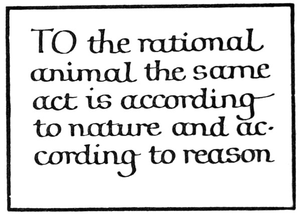
Fig. 63.
PROBLEM I. (A SHEET OF PROSE)
To write out the Pater noster (50 words) in a formal round-hand (arranged in “mass” of equal lines) on a sheet of “foolscap” (i.e. 17 inches high and 1312 inches wide).
If the size of the writing be considered of the first importance, a few words are written out in a script chosen to suit the subject, the space, &c., and these are measured to find the area which the whole text so written would occupy (fig. 64). The size of the script is then modified, if necessary, to suit the available area. [p091]
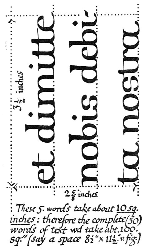
Fig. 64.
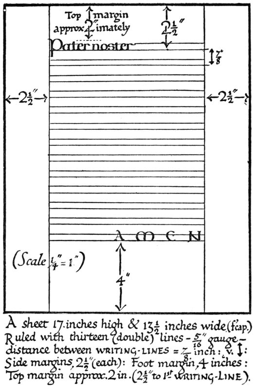
Fig. 65.
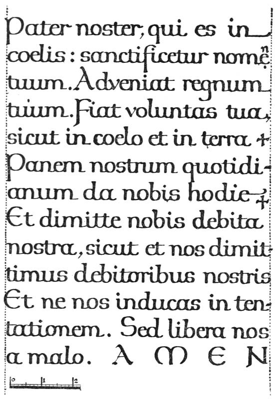
Fig. 66.
[p094]
Frequently it is desirable first to determine the sizes of the margins. These depend on various considerations of the position and office of the MS., but more particularly on the size of the sheet and the character of its future environment14 (see p. 351).
The top and side margins may be of equal width—or the top may be a little less (see a, fig. 70). Ample space should be allowed for the foot margin, which is generally about twice the width of the top, but may vary in different cases, according as the text falls short of or encroaches upon it (see pp. 352, 342). For a plain foolscap sheet: sides (each) 212 inches, top (approx.) 2 inches, and foot (approx.) 4 inches, may be taken as suitable margins (fig. 65).
The width of the sheet (1312 inches) less the two side margins (212 inches each) gives the length of the writing lines (1312 – 5 = 812 inches). One or two such lines are written experimentally in a suitable script (say, 516 inch), and the average number of words per line (four) is found.
The number of words in the complete text (fifty) will determine the number of lines: an extra line or so may be allowed for safety (504 = 1212, say, thirteen). The spacing of these is calculated—
516 in. writing requires about 78 in. (close) spacing (p. 79): Thirteen lines at 78 in. gives 1138 in. = depth of text: 1138 in. from 17 in. leaves 558 in.15 for head and foot margins
—and if the space is not sufficient, the writing is made a little smaller. If, on the other hand, the [p095] marginal depth left over were excessive, the writing might be made a little larger in order to fill up the space.
PROBLEM II. (A SHEET OF POETRY)
To write out “He that is down, needs fear no fall,” in a formal round-hand on a sheet of foolscap (i.e. 17 inches high × 1312 inches wide).
Here there are three verses of four lines each: these with two space lines, left between the verses, give a total of fourteen lines (fig. 67).
Fig. 50.
[p304]
[p305]
Fig. 59.
Fig. 65.
Fig. 10.
Fig. 9.
Fig. 183.
Fig. 145.
Fig. 154.
Fig. 54.
Fig. 55.
Fig. 66.
[p324]
[p327]
[p083]
[p082]
[p084]
Fig. 51.
Fig. 57.
[p066]
[p-xxv]
Fig. 52.
[p244]
Fig. 53.
Fig. 152.
[p262]
Fig. 56.
[p300]
[p072]
[p073]
[p077]
[p297]
[p085]
[p086]
[p071]
[p416]
Fig. 172.—Fig. 12, enlarged twice linear (see p. 305 & Plate VIII.). Note: top line is cut down.
[p246]
[p311]
[p323]
Fig. 58.
[p414]
Fig. 60.
[p100]
[p103]
[p351]
[p265]
[p107]
Fig. 61.
Fig. 62.
Fig. 63.
SETTING OUT, & FITTING IN
[p099]
Fig. 77.
Fig. 64.
14 For example, a framed sheet does not require such wide margins as a similar sheet unframed.
Fig. 70.
[p352]
[p342]
[p079]
15 Really about 6 inches, because the top line of writing will not occupy its full 78 inch, the unused part of which adds to the top margin (see fig. 65).
Fig. 67.
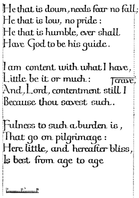
Fig. 67.
A poem has a given number of lines of various lengths, and only very strong reason or necessity can justify our altering its proper form (e.g. by breaking up the lines) in order to make a mass of equal lines. Such theoretical margins as are possible in the treatment of prose can therefore seldom be observed in writing out a poem, and, unless the height or the width of the sheet can be altered, there is apt to be an excess of margin in one or the other direction. When such excess margin is obviously unavoidable, no objection can be made to its appearance. Poetry may conveniently be treated as “fine writing” (see p. 263).
If the size of the writing be considered of the first importance, several of the longer lines (e.g. the first and the eleventh in the poem given) are written on a piece of paper in the size of writing preferred (say, 14 inch). By laying this paper on the given sheet, it is seen whether such lines would allow of sufficient side margins. (If they would not, the writing may be made smaller.)
The height of the writing (14 inch) must allow of the full number of lines (fourteen) being properly [p097] spaced on the sheet (17 inches) with sufficient head and foot margins. This is calculated—
14 in. writing requires approximately 34 in. spacing (p. 79): Fourteen lines at 34 in. gives 1012 in. = depth of text: 1012 in. from 17 in. leaves 612 in. for head and foot margins
—and if the space were not sufficient, the lines might be made a little closer, or the writing a little smaller (or, if necessary, the blank lines might be left out between the verses; p. 123).
The Sizes of the Margins.—It will be seen that the above method is primarily for settling a length of line which will allow of sufficient side margins. The process can be reversed; if necessary, the side margins are made of a given width, thus determining the exact length of the line, the size of writing which this line allows being found experimentally.
Note.—The extra long lines may slightly encroach on the right-hand margin: the effect of this is balanced by the falling short of other lines.
SPACING & PLANNING MANUSCRIPT
In penmanship great nicety of spacing and arrangement is possible. The ascending and descending strokes may be shortened or drawn out, the spaces between letters and words may be slightly increased or decreased, the lines may be written near or far apart, and the letters may be written with a broader or narrower nib.
Elaborate spacing and planning, however, should not be attempted at first, and straightforward, undesigned work is often the best. The student is apt to waste time writing out an elaborate draft [p098] in order to ascertain how to space the matter. This is a mistake, because if written well, it is a waste of good writing on a mere draft; if written ill, it is bad practice. The briefer experiments and calculations are, the better, though the simplest problem always requires for its solution a calculation or process of guess and trial (such as suggested in the preceding pages). Practice will make people very good guessers, and the best work of all is done when the worker guesses rightly, and follows his guesses with the actual work, itself the trial and proof of accuracy.
CHAPTER VI MANUSCRIPT BOOKS16 MS. Books: Tools & Materials — Methods & Proportions — The Size & Shape of the Book — The Widths of the Margins — The Size of the Writing, &c. — Ruling — MS. Books: General Remarks.
MS. BOOKS: TOOLS & MATERIALS
The making of manuscript books, based on a study of the early MSS., offers the best training to the scribe and illuminator in writing, lettering, rubricating, gilding, illuminating initials and borders, and miniature painting, and is the best means of mastering the foundations of Book Typography and Decoration.
Materials, &c. for MS. Books; Paper (see pp. 51, 103, 111, 317); Vellum and Parchment and Pounce [p099] (see pp. 110, 167, 173–5).—Cut a small sheet the size of a page of the book, and clip the long edge between two flat pieces of wood (holding it as it would be if bound). If the page will bend over and stay down by its own weight, it is thin enough (R fig. 68); if it stands up (W), it is too stiff.
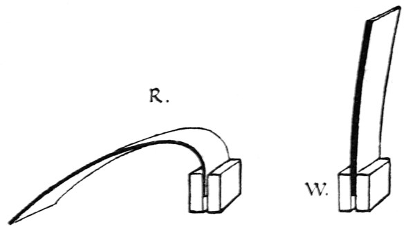
Fig. 68.
Cutting Sheets.—A frame or template (the size of the sheet desired) is used by parchment makers. It is useful for cutting out the sheets for a common size of parchment book. They are cut on the end-grain of wood, or on card or glass.
Folding.—A Folder, as used by bookbinders (or a bone paper-knife), is useful, and also a Set or T-Square for testing right angles, &c. The fold and the top edge of each book-sheet are commonly squared by proper folding.
Ruling, &c. (see p. 343).—For marking distances of lines, a carefully prepared paper17 scale or pattern (p. 25) and an awl (p. 109), or a [p100] “star-wheel”—having regular intervals between the spikes—may be used. Or the ruling—of the writing lines—may be simplified by using a stout card frame (internally the size of the text-column) with strips glued across it: for a common size of book this might be made in stout tin or other metal. The lines are commonly ruled with a ruling stylus (see figs. 72, 77), or a sort of “rake” may be made to rule six lines at once.
Writing, Colouring, Gilding, Binding (Chaps. II., X., IX., XVI.).
METHODS & PROPORTIONS
Having to make a manuscript book for a specific purpose, the scribe formulates in his mind a general plan of the work, and decides approximately the respective sizes of page and of writing which seem most suitable.
He endeavours to fashion the book in accord with its use, and therefore allows the (most suitable) material, the subject-matter and the office of the book, and the way in which it will be read and handled, to determine as far as is possible the proportions of its parts, and its treatment as a whole.
Its material may be vellum, parchment, or paper, on which a variety of pens, brushes, and other tools, with inks, colours, and metal foils, may be employed. Its office may be “useful” or “ornamental”; its contents may be long or short, weighty or light, and of greater or less worth; it may be for public or for private use; and the book may be intended to be placed on a lectern, to be held in the hand, or to be carried in a coat pocket.
In following out such natural indications, the [p101] practised craftsman relies greatly on his working methods, preferring a direct mode of treatment to one which is too ingenious or subtle. In deciding a doubtful point, a common-sense of proportion is a sufficient guide, and one may generally assume that great works are best “writ large,” and that large letters look best on an ample page, and vice versâ.
The main proportions which have to be considered are interdependent, and follow one another in their natural order (see p. 256), thus—
- 1. The size and shape of the book.
- 2. The widths of the margins.
- 3. The size of the writing, &c.
And the methodical scribe makes his books of certain definite and regular sizes, each size having corresponding and regular proportions of margins and writing. Though these may greatly depend on individual taste and experience, it is suggested that—like all good designs—they should be allowed as far as possible to settle and arrange themselves.
THE SIZE & SHAPE OF THE BOOK
A book is thought of by the scribe chiefly as an open book, and the width and height of its pages are chosen with a view to its convenient shape and pleasant appearance when open. The most economical sizes into which a suitable sheet of paper can be folded (or a skin of parchment can be cut) may commonly be allowed to decide these proportions.
When a printer is about to print a book he chooses a sheet of paper which will fold into a suitable shape and size. If the sheet be folded [p102] once to form two leaves, the book is called a folio (fig. 69); folded again to form a “section” of four leaves—a quarto (4to); or folded a third time to form a section of eight leaves—an octavo (8vo).18 [p103] The book is made up of a number of sections sewn on to strings or tapes (see p. 347).
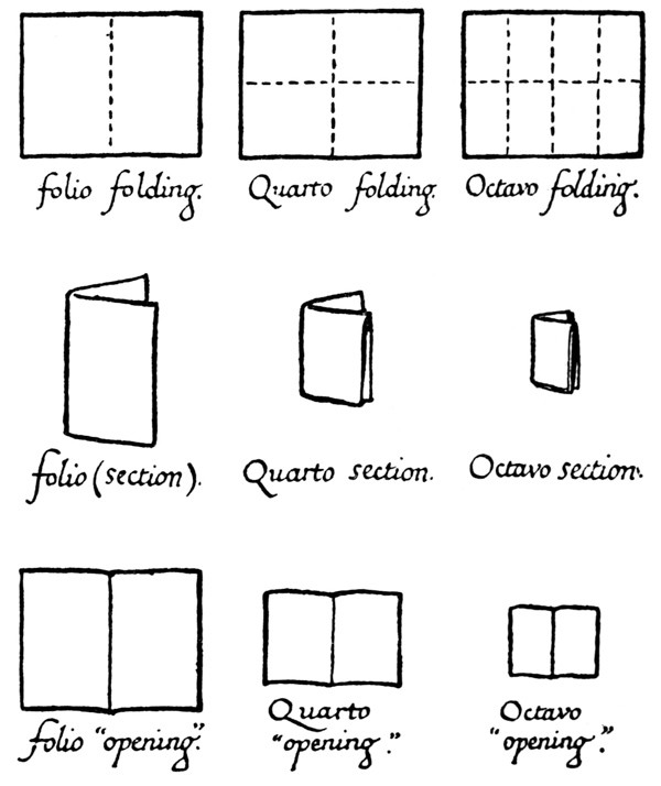
Fig. 69.
The penman will find that, besides saving time and labour, it conduces to good work if he keep to certain regular sizes for “large,” “medium,” and “small” books; and, if the ordinary sheets of paper which he uses will fold in convenient folio, quarto, and octavo sizes, it is well that he make these his standards for paper books.
Paper being made in sheets of various dimensions, by folding a large or a small sheet, a “large” or “small” folio—4to, 8vo—can be obtained.
It may be noted that the length and the width of sheets of paper19 are very commonly about as 9 is to 7. And therefore, when the sheet is folded for folio or octavo, the proportions are roughly about 7: 412, which are very good proportions for a page of a book. It is obvious that a narrow (“upright”) book is easier to handle and more pleasant in appearance (when open) than an album or “oblong” shape of book (b and c, fig. 70).
THE WIDTHS OF THE MARGINS
Margins are necessary in order to isolate and frame a text: thus they contribute to its legibility and beauty. It is better that they be wide rather than narrow (see p. 106, & Note, p. 265); but excessively wide margins are often neither convenient nor pleasing (see p. 222).
The “page” or column of text should be in such proportion to the page of the book, and be placed on it in such a way as to leave adequate [p104] margins on every side. A narrow column of text is generally best, for short lines are easiest to write and to read, and do not tire the hand, or the eye, in passing from one line to the next. For this reason the text is often divided into two or more columns when the page is wide, or the writing is very small in comparison.
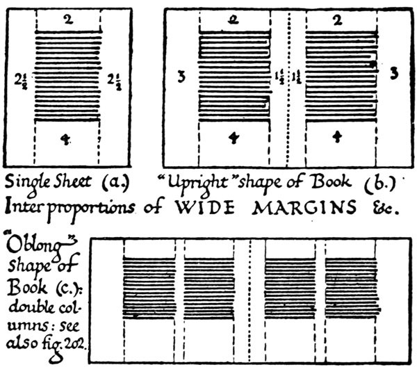
Fig. 70.
The exact proportion of margin to text in a given page depends on circumstances, and is largely a matter of taste (ex. fig. 71 & note 2, b, p. 256). But just as it is advantageous generally to keep to certain [p106] sizes of pages, it is well to keep to certain—corresponding—sizes of margins for regular use.
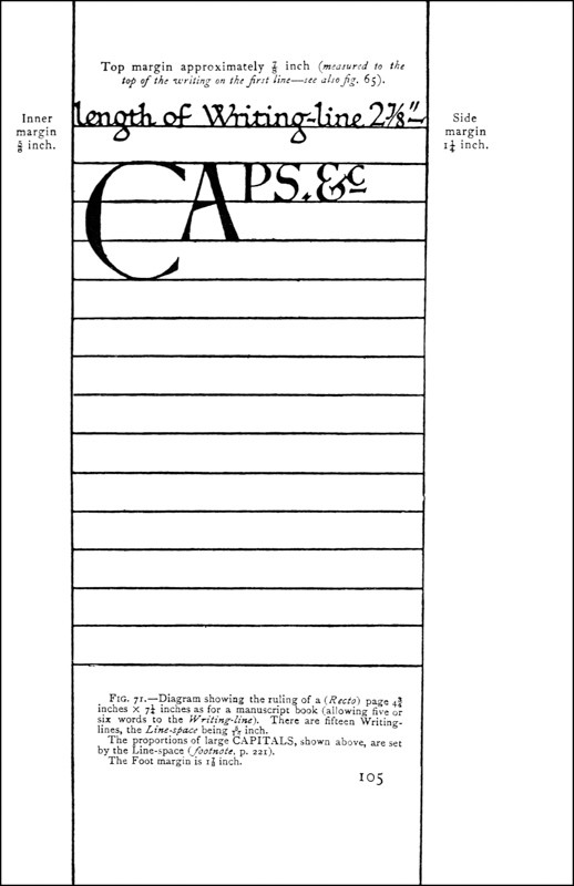
Fig. 71.—Diagram showing the ruling of a (Recto) page 434 inches × 714 inches as for a manuscript book (allowing five or six words to the Writing-line). There are fifteen Writing-lines, the Line-space being 516 inch.
The proportions of large CAPITALS, shown above, are set by the Line-space (footnote, p. 221).
The Foot margin is 178 inch.
Inner margin 58 inch. Side margin 114 inch. Top margin approximately 78 inch (measured to the top of the writing on the first line—see also fig. 65).
The proportions of the margins to each other follow a sort of tradition (see fig. 70), the foot margin (4) usually being twice as wide as that at the top (2), the side margins generally greater than the top and less than the foot. The two pages of an opening may be viewed as one sheet having two columns of text; and the two inner margins, which combine to form an interspace, are therefore made narrow (about 112 each), so that together they are about equal to one side margin (fig. 70). These proportions (112 : 2 : 3 : 4) approximate to the proportions common in early MSS.
Sufficient and proportional margins add greatly to the usefulness and beauty of a book. That the writers and illuminators used them when books were read and valued in a way we can scarcely realise now, shows that such things are not, as some might suppose, a matter of affectation. Besides the natural fitness of the common proportions commends them: a deep foot margin is a foundation to the whole, and gives a spare piece for the reader to hold,20 and wide side margins rest the eyes and keep the text from “running off the page” at the end of each line; and (the two) narrow inner margins combine to separate the pages sufficiently, but not too far, so that they form two “columns” together, framed by the outer margins of the open book.
When books are meant to be bound, from 116 inch to 18 inch extra margin should be allowed all round the page for the cutting down and binding. The [p107] binding is apt to encroach on the inner margins, especially in vellum books, which do not open fully; in order, therefore, that the inner margins may keep their proper width, an extra width of 18 to 14 inch (according to the stiffness of the material) is allowed.
THE SIZE OF THE WRITING, &C.
The shape, size, and margins of the page (already settled) together determine the length of the writing-line (see fig. 71); and the size of the writing should be such as will allow a reasonable number of words to that line.21
Eight or nine words to the line is a common proportion in ordinary printed books, and may be taken by the scribe as his ordinary maximum. Lines having very many words are difficult to read.
On the other hand, lines of only two or three words each are generally tiresome, though they may be allowed in special cases of fine writing (see p. 262), where it is less necessary to economise space or time, and the effect of an even mass is not desired. But in any case where there is an attempt to make the right-hand edge of the text approximately even, at least four or five words to the line are necessary; the scribe may therefore take four words per line as his ordinary minimum.
We may say generally, then, that an ordinary manuscript book should contain between four and eight words (or between 25 and 50 letter-spaces) to the line. [p108]
The exact size of the writing allowed in a given case may be found by a process of guess and trial, but this is seldom necessary for the practical scribe who uses regular sizes for regular occasions.
The line spacing.—The size of the letter determines approximately the distance apart of the writing-lines (see pp. 79, 327). Much depends on whether the ascending and descending letters are long or short (see fig. 154).
The number of writing-lines to the page equals the number of times that the line-space is contained in the text-column (i.e. the height of the page less the top and foot margins)—allowing for the top line not requiring a full space (see fig. 71). Any fractional space left over may be added to the foot margin, or, if nearly equal to one line-space, a little may be taken from the margins to complete it.
The Large Capitals are commonly one, two, or more of the line-spaces in height (fig. 71, & p. 128).
RULING
Having folded and cut the large sheet of paper into small (book) sheets of the size determined on, take one of these as a pattern and rule it throughout as if it were to be used in the book.
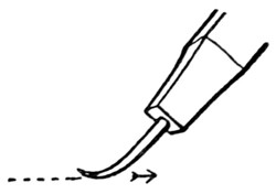
Fig. 72.
The ruling stylus has a blunt point, which indents the paper, but does not scratch it. A stout pin bent to a claw shape and held in a piece of wood does very well (fig. 72). [p109]
Under the writing paper there should be a “pad” of ordinary paper (or blotting paper).
The marginal lines are ruled from head to foot of each leaf (a, fig. 73). Besides being a guide for the writing, they give an appearance of straightness and strength to the written page.22
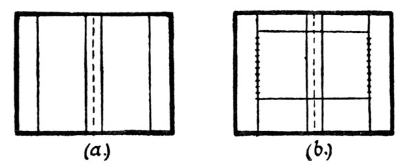
Fig. 73.
The writing lines are ruled across, between the marginal lines, their places having been indicated by equidistant dots (b, fig. 73).
A dozen or more of the small sheets of the book are piled together on a board with their top edges exactly coinciding, and the pattern sheet is accurately placed on the top of the pile. The pile of sheets may be fixed by a narrow piece of wood placed across and screwed down (fig. 74). (See Addenda, p. 25.)
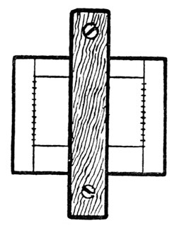
Fig. 74.
Fig. 75.
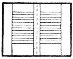
Fig. 76.
The writing line dots are [p110] pricked through all the sheets by means of a fine awl or needle set in a wooden handle (fig. 75).
The writing lines are ruled as in fig. 76 (sometimes across the narrow inner margins).
Fig. 77.
For double writing lines a double-ruling stylus may be made of two pins fixed in a wooden handle at the exact width of the writing gauge (fig. 77).
MS. BOOKS—GENERAL REMARKS
Sections (p. 102).—A section, or “gathering,” commonly consists of four book-sheets, folded in half into eight leaves (i.e. sixteen pages), but three or even two sheets are sufficient when they are extra thick, and five or six may be used when extra thin. Parchment sheets should have their smooth sides so placed together that each “opening” of the book has both its pages rough or both smooth and the pages are pounced after they are ruled (see p. 174).
Before the writing is begun the pages of the section are numbered on the inner marginal line, [p111] about 12 inch or so below the footline. This will prevent mistakes.
Fly-leaves.—One or more leaves of the first and last sections in a book are left blank (besides the extra sheet or section (p. 346) which is used in the binding—attached to the cover). A book of any size or importance ought to have at least three fly-leaves at the beginning, and three or four at the end. These extra leaves protect the manuscript, and, in a sense, constitute margins for the whole body of the text. They may also be used to make thin books thicker, for the sake of the binding. At the end of Service books, or other books likely to be of permanent interest, additional fly-leaves should be provided for notes and annotations (see pp. 344, 346).
Rough or Smooth Edges.—The rough “Deckle” edges of hand-made paper are inconvenient in a book of any thickness, and should be trimmed off after folding, though they may be left in the case of very thin books. The deckle edge should not occur at the top of the page, as it would there be a trap for dust, and because it is important that the tops of pages should all be level. The top edge or head of a book is often cut and gilt in order to keep out the dust—this is called “Library gilt.” It is more suitable, however, that all the edges be gilt.
The Top Margins throughout the book are kept quite level. Any irregularity at the top of a page catches the eye at once, while slight differences at the side, or considerable differences at the foot, may occur without spoiling the appearance of the margins. All measurements for marginal and writing lines, &c., are therefore made from the [p112] fold of the book-sheet and from the top edge, which is cut at right angles to the fold.
Regular Writing.—In writing one page it is a good plan to have its fellow page, or a similarly written one, fixed on the desk beside it as a pattern. This will save the beginner from a very common error—writing larger or smaller (which of course spoils the look of the pages).
Initial Page.—The text of a book commonly begins on a recto, or right hand, page (see p. 365).
CHAPTER VII VERSAL LETTERS & COLOURED CAPITALS Development of Versals — General Analysis of Versals — Notes on Construction of Versals — Spacing & Arrangement of Versals.
DEVELOPMENT OF VERSALS
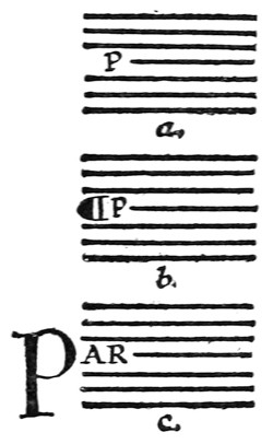
Fig. 78.
The earliest books consisted of a number of lines of continuous writing in capital letters. There were seldom any divisions of the text—into paragraphs, chapters, or the like—or even of one word from another; nor were important words distinguished by larger initials. The first division of paragraphs was made by a slight break in the text and a mark; later, the first letter of the first complete line of the new paragraph was placed in the margin and written larger. When “small-letters” were evolved, capitals ceased to be used for the body of the text, and became distinguishing letters for headings and important words. [p113]
The capitals written at the beginnings of books, chapters, and paragraphs grew larger and more ornamental, and at length were made in colour and decorated with pen flourishes. Such letters, used to mark the beginnings of verses, paragraphs, &c., were called “Versals.”23
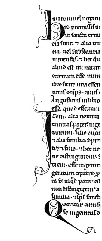
Fig. 79. (13th century).
In modern printing and ordinary writing the first line of a paragraph is generally indented (a, fig. 78), but the earlier method of employing a special mark or letter (b or c) is more effective, and it might very well be used, even in modern printed books, for fine editions. Affording a legitimate opening for illumination and book-ornament, it was (and is) the natural method for the penman, who, starting with these useful capitals, by flourishing them—in their [p114] own colour, or by dotting, outlining, or ornamenting them, with a contrasting colour (see fig. 79, from an old MS.), evolved the Illuminated Initial.
Types of Versal Letters (examples: Plates IX., X., XI., XII., and fig. 1, 78 to 94, 150, 161, 165, 166, 189).—The earlier Versals had very simple and beautiful pen shapes, and are the best models for the modern penman to follow. After the fourteenth century they were often fattened and vulgarised and overdone with ornament. In this way they not only lost their typical forms; but their “essential forms”—as letters derived from the Roman Alphabet—became much disguised and confounded (see fig. 128).
[p263]
[p079]
[p123]
16 MS. Books are further considered in Chap. XVI.
[p051]
[p103]
[p111]
[p317]
[p110]
[p167]
[p173]
[p175]
Fig. 68.
[p343]
17 The direct use of a thick wood or metal scale may lead to inaccuracy.
[p-xxv]
[p109]
Fig. 72.
Fig. 77.
Distinctiveness in the Spacing of the Lettering necessitates sufficient interspaces: the following common spacing of Letters, Words, Lines, &c., may be modified to suit special circumstances.
Fig. 69.
18 The two, four, eight (or more) pages are printed on both sides of the sheet before it is folded. Two or more sheets are generally folded and put together to form a folio “section.”
[p347]
19 Such as Foolscap (17″ x 1312″), Crown (20″ x 15″), Demy (2212″ x 1712″), Royal (25″ x 20″), &c.
Fig. 70.
[p106]
[p265]
[p222]
Fig. 71.—Diagram showing the ruling of a (Recto) page 434 inches × 714 inches as for a manuscript book (allowing five or six words to the Writing-line). There are fifteen Writing-lines, the Line-space being 516 inch.
The proportions of large CAPITALS, shown above, are set by the Line-space (footnote, p. 221).
The Foot margin is 178 inch.
Inner margin 58 inch. Side margin 114 inch. Top margin approximately 78 inch (measured to the top of the writing on the first line—see also fig. 65).
[p221]
Fig. 65.
20 In Oriental books, which are sometimes held by their top margins, the top is deepest.
21 If the average number of words be previously fixed—as in a poem (see p. 95)—that will practically determine the size of the writing.
[p262]
[p327]
Fig. 154.
[p128]
Fig. 73.
22 They are often ruled double (see p. 343), and sometimes the top and foot lines are ruled from edge to edge of the sheet.
Fig. 74.
Fig. 75.
Fig. 76.
[p102]
[p174]
[p346]
[p344]
[p365]
23 Though Versals may generally be regarded as paragraph marking letters, it is convenient to apply the term to the Versal type of letter—e.g. “a heading in Versal letters” (see fig. 91).
Fig. 78.
Fig. 79. (13th century).
Fig. 1.
Fig. 94.
Fig. 150.
Fig. 161.
Fig. 165.
Fig. 166.—Pen-capitals from a tenth-century MS. (writing-lines dotted in fig. to show spacing method).
Fig. 189.—(See also Plates VI., XI., XXII., figs. 79 and 84, and p. 420.)
Fig. 128.
GENERAL ANALYSIS OF VERSALS
1. THE LETTERS
(Pen-made), Built-up, Ornamental (coloured), “Gothic” Capitals (Round and Square forms).
2. HORIZONTALS—
STRAIGHT:Medium—commonly the width of the nib.
CURVED:Thin—the thin stroke of the pen.
3. PERPENDICULARS:
Built-up, slightly curved in on either side.
4. SERIFS:
Long, thin, slightly curved.
5. LONG STEMS:
Various (see p.
119, & figs.
84,
90).
6. SPACING—
Letters & Words:Various (see figs.
89,
92,
166).
Lines:Usually one or more of the
line-spacesapart (see pp.
126,
128).
7. ARRANGEMENT:
Singly:set in text or margin, or part in both (fig.
86).
Grouped:after large initials (fig.
92).
In Lines:wide or close, often one word to the line (fig.
89).
8. MEASUREMENTS:
Stem width:commonly two or three widths-of-nib across thinnest part (fig.
165).
O height:commonly one, two, or more of the line-spaces.
9. COMPONENT PARTS:
Ahas approx. 10 strokes & filling.
Bhas approx. 8 strokes & filling.
Chas approx. 7 strokes & filling.
and so on (see fig.
81).
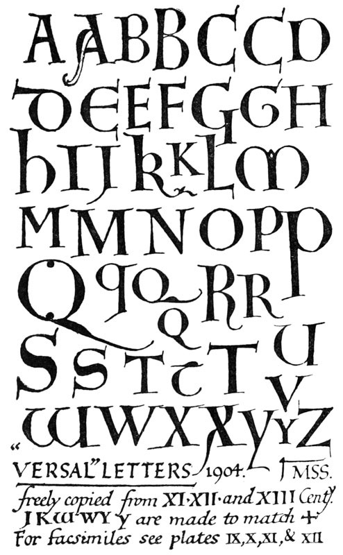
Fig. 80.
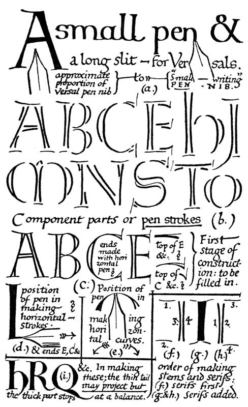
Fig. 81.
NOTES ON CONSTRUCTION OF VERSALS
(See figs. 80, 81, 85, 165)
Versal Letters are properly built-up (p. 291) with true pen-strokes (b, fig. 81). Drawn or painted, they acquire a different character (p. 292). Their office being to mark important parts of the text, they are generally distinguished by colour and freedom of form—tending to curves and flourishes.
The pen has an extra long slit (12 inch to 34 inch), and the writing-board may be lowered (see fig. 46, b) to permit of the thick, liquid colour running out freely. The nib is of the ordinary shape (but not too oblique), and generally rather less in width than the nib used for the accompanying text (a, fig. 81).
The outlining strokes are quickly written and immediately filled in, each letter being loaded well with the colour, which thereafter dries evenly, with a slightly raised “flat” surface. The liquid colour should be fairly thick (see colour, p. 176).
“Gothic lettering” is a term used for “Black-letter” and related types, as distinguished from “Roman” types. “Gothic” capitals tend to roundness, the small-letters to angularity, but in each the abrupt change from thick to thin strokes, and the resulting contrast of stroke, are characteristics—the result of pen work.24 In Versals this contrast is marked; the ends of the thinner strokes spread (see Addenda, p. 25, & cross-bar of A, fig. 71), and the heavy parts are crossed by thin serifs. Versals may retain their pen character and yet approach [p119] the “Roman Letter” (p. 294), or be changed into the ornate “Lombardic” (p. 34). They are capable of great variety, and the “round” or “square” D, E, H, M, and W may be used at pleasure.
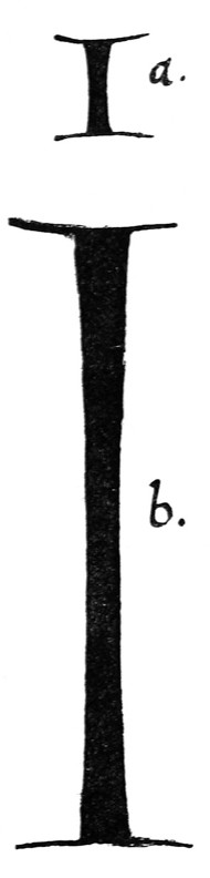
Fig. 82.
The Stems curve in slightly on either side. When they are very tall the mid part may be quite straight, imperceptibly curving out towards the ends (b, fig. 82). This gives an effect of curvature throughout the length, while keeping the letter graceful and straight. The head of a stem (especially of an ascender) should be slightly wider than the foot (fig. 83). This applies generally to every sort of built-up capitals.
Fig. 83.
The stem width may be nearly the same in Versals of different heights (a, fig. 84): generally the letters tend to become more slender in proportion as the letters grow taller (b). Very large Versals (or initials) are often made with a hollow stem to avoid a heavy appearance (L, fig. 84). [p120]
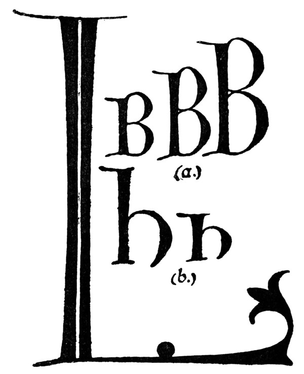
Fig. 84.
The Serifs are long and slightly curved in ornamental forms (fig. 79): shorter, and nearly straight in stiffer forms (fig. 166). In many cases the serifs appear to have been written first, the stems being added between them (f, fig. 81)—in old MSS. the stems often show ragged ends crossing the serifs. Sometimes the serif appears to have been added to the stem in two pieces, half on either side springing from the corners of the stem (g). The safest way seems to be the complete finishing stroke added to, and forming sharp angles with, the stem (h).
Arms or Branches.—Width of nib at start, and built-up at free end. (Pen horizontal, figs. 81, 165). [p121]
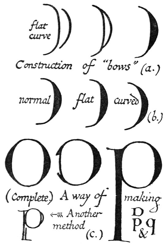
Fig. 85.
The Bows or Curves of Versals (and of built-up letters generally) are begun with the inside stroke—a rather flat curve: and finished with the outer stroke—a pronounced curve (a, fig. 85). This preserves [p122] the continuity of the interior curve, together with the clean contrast of the thick and thin strokes (see inside shapes, p. 253). The normal form may be flattened or curved a little (b), but exaggeration in either direction produces a degraded form. Part round letters, as D, P, and q, may be begun with a complete inner oval, or a nearly completed O (to which the stem is added); this preserves their interior symmetry (c).
The beauty and quality of Versal letters depends very much on their freedom; touching-up or trimming after they are made is apt to spoil them; and when good letters are made with a free hand, minute roughnesses, which are due to their quick construction, may be regarded as shewing a good rather than a bad form of care-less workmanship (see (c) fig. 164).
SPACING & ARRANGEMENT OF VERSALS
(Allowing for the special treatment of Versals called for by the extreme freedom and elasticity of their pen forms, the following remarks apply generally to the spacing and arrangement of coloured capitals in written pages)
Versals accompanying Small Text are generally dropped below the writing-line, so that their tops are level with the tops of the small letters (fig. 86).
Sizes of Versals.—Letters which are of the same importance—i.e. serve the same purpose—are usually of like size and form throughout; and the more important a letter, the more it tends to be elaborated and decorated (see figs. 90, 92).
Special words in Text marked by Versals.—Where coloured capitals are used throughout the text (fig. 92), the colours are usually varied (pp. 134, 185). [p123]
Line beginnings marked by Versals.—Where every line on a page begins with a coloured capital, the majority of the forms are kept rather plain (see (5) p. 136). They may be effectively treated as a band of simple or variegated colour (p. 136). This is a common treatment for a list of names or a poem; sometimes, especially if there are many lines, simple-written capitals (p. 297) may be used instead of Versals.
Verses or Paragraphs may be marked by Versals set in the text (a), or part in margin, part in text (b), or wholly in the margin (c, fig. 86). The marginal capital is the simplest, and it has the advantage of leaving the page of text entire; it may, however, sometimes be desirable to break the continuity by an inset capital, especially in cases of closely written text, or of stanzas not spaced apart (see p. 138).
The first word of a paragraph, which is begun with a Versal, is often completed in simple-written capitals of the same colour as the text (a, fig. 86).
Various ways of marking Paragraphs.—(a) The paragraph marks
Line-Finishings at the ends of Verses, &c. (pp. 205, 425), may be made with the Versal pens and colours. [p124]
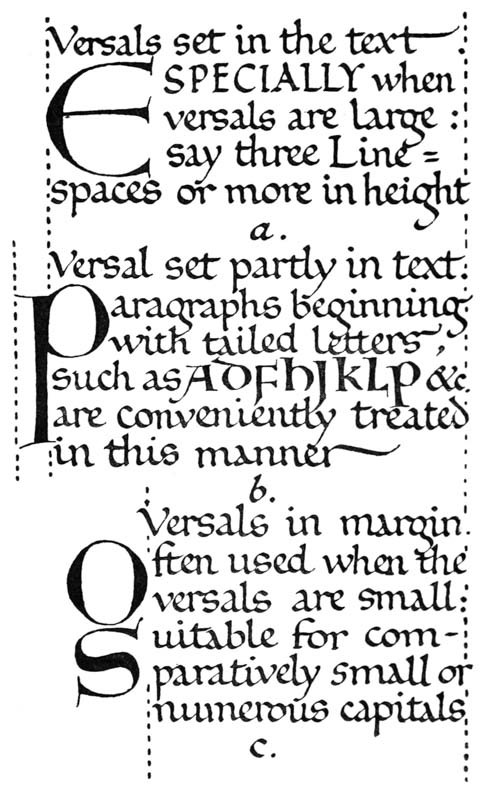
Fig. 86.
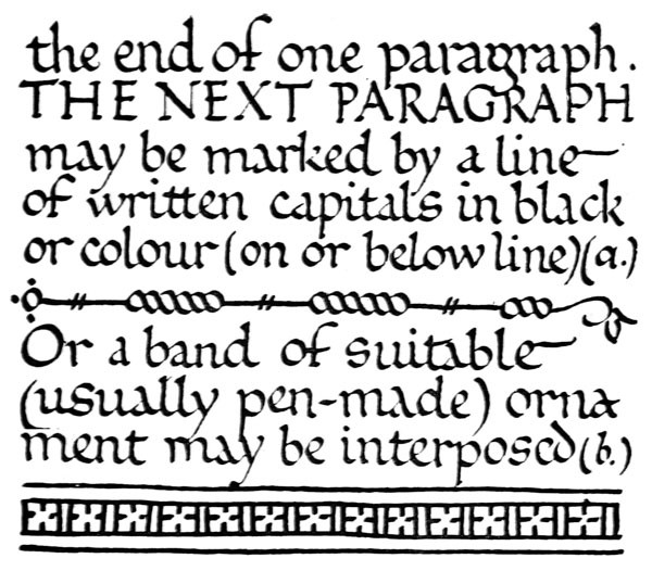
Fig. 87.
[p125]
To mark Chapters (or even Books), extra large Versals (fig. 88) may be used, in lieu of more elaborate initials. Smaller Versals may be grouped round about, beside or inside initials (p. 208 & fig. 92).
Headings and Pages in Capitals (see also pp. 128, 132).—Each line of capitals is generally kept uniform throughout its length,25 though different lines vary in size and colour (see fig. 89). If it be possible it is well to keep the individual word entire [p126] and to let the heading or page contain the complete initial phrase or sentence (see fig. 91).
Generally the greater the number of capitals the plainer their forms are kept, and the closer their spacing. It is best to keep to the regular method of spacing the lines of Versals one of the writing-line spaces (or more) apart—though in special cases the Versals may be independent of the writing-lines.
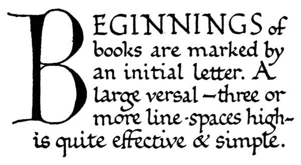
Fig. 88.
Spacing Out.—Coloured letters and ornaments are usually put in after the plain MS. has been written. A very little practice enables the scribe accurately to guess the amount of space which he should leave for the Versals, &c., whether it is designed to have several lines of them, or a single letter only on the page. A few pencil marks may be used to settle a doubtful point, but an elaborate sketching or setting out in pencil spoils the freedom of the work. [p127]
CHAPTER VIII BLACK & RED Rubricating — Initial Pages or Title Pages — Prefaces & Notes in Colour — Pages with Coloured Headings — Page or Column Heading & Initial — Versals in Column or Marginal Bands — Stanzas or Verses marked by Versals — Music with Red Staves — Tail-Pieces, Colophons, &c. — Rubricating: General Remarks.
RUBRICATING
“Red, either in the form of a pigment or fluid ink, is of very ancient and common use. It is seen on the early Egyptian papyri; and it appears in the earliest extant vellum MSS., either in titles or the first lines of columns or chapters. The Greek term was μελάνιον κόκκινον; Latin minium,26 rubrica.”—(Thompson’s “G. & L. Palæography,” p. 51.)
Rubricating, or the adding of Red, or other coloured, letters, line-finishings, or signs, to a MS. or Book, in which the main body of the text is already completed in black, constitutes in itself a very useful and effective form of decoration. It is, moreover, a connecting link between plain writing and illumination proper; and we may safely assume that the artists who made the beautiful illuminations of the Middle Ages were trained as scribes and rubricators.
INITIAL PAGES OR TITLE PAGES
Fig. 89 represents an Initial Page in Red Capitals. (The same arrangement may of course be used [p128] with a variety of colours and with gold: see Note (4) below). Such a page is, as it were, an “illumination” to all the pages, following it in black text.
Title Pages came into fashion after printing was introduced. Early MSS. commonly began with the opening words written in large, decorated capitals, the title sometimes being written quite small, near the top of the page: other details were commonly put in the colophon in early books (see p. 142).
When the title is more important, in a literary sense, than the opening sentence, it may be well to follow the modern fashion. But when there is a finely worded opening sentence—perhaps the key-note to the rest of the text—while the title is merely for reference, it seems reasonable to magnify and illuminate the actual beginning of the book rather than the mere name of it (see p. 365).
Note (1).—In fig. 89 the title—(JESU CHRISTI) Evangelium Secundum Joannem—is written in as a decoration of the initial word; the old form “

(2) Where IN is an initial word, to enforce narrow initial I, both letters may be magnified.
(3) The scale of the lettering corresponds with that of the ruled lines (these do not show in the figure): the letters and the interlinear spaces are each one line high; the initial word is four lines high. Such a mode of spacing is very simple and effective, and will save the rubricator much unnecessary trouble and fruitless planning (see footnote, p. 221).
(4) Other Colour Schemes.—All Burnished Gold (or with Title in red); or IN gold, with smaller capitals Red (or in Blue and Red lines alternately—or Blue, Red, Green, Red: see p. 181). [p129]

Fig. 89.
PREFACES & NOTES IN COLOUR
Fig. 90 represents a preface, or note, written in red.
It was a frequent practice in old MSS., where there were prefaces, or prologues, or notes—not actually part of the text—to keep these distinct by writing them in red. A somewhat similar usage still exists in modern typography, where such parts are sometimes distinguished by Italic type (see p. 315).
The distinction of a preface, “rubric,” or note from the main body of the text makes a book more readable, and, as a page of red (or blue) writing is very pleasant and effective, we may certainly take advantage of such a reasonable excuse for introducing it. Entire books have been written in red, but this is a questionable mode, as too much red text would tire the eye.
Note (1).—The writing is founded on the tenth-century English hand given in Plate VIII.
(2) The flourishes on s and e fill gaps at the ends of the lines, and the spread out A M E N fills the last line.
(3) The Headline is in simple written capitals.
(4) The effect of colour contrast of the built-up Ps with the simple writing: the solid Ps (though really the same colour) appear to be a much deeper red than the writing, which is lightened by the intermingled white of the paper.
(5) Other Colour Schemes.—The Versals (Pp) in burnished gold; the rest in red or blue. [p131]
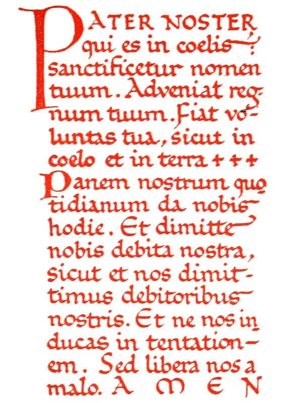
Fig. 90.
PAGES WITH COLOURED HEADINGS
Fig. 91 represents the first page of a chapter (or a book) with a Heading in red capitals.
It is convenient in practice clearly to distinguish between the two modes of beginning—
- (a) with an illuminated Initial-Page (see fig. 89), or,
- (b) with an illuminated Heading (see fig. 91).
The former may be treated as though it were a decoration to the whole book. The latter is intended more particularly to decorate its own page.
The Heading should therefore be proportionate to the body of the text below it. About one-third Heading and two-thirds text make a good proportion. A “Heading” occupying half, or more than half, of the page is apt to look disproportionate, and it would be preferable to this to have a complete, or nearly complete,27 Page of coloured capitals.
Note (1).—The full effect of black and red is obtained by an arrangement of the two colours in marked contrast.
(2) The lines are used as a scale for the Heading, the red capitals and interspaces each being one line high. If a Heading so spaced appear too close to the first line of black writing, another line space may be left.
(3) The round Es are used to fill out the second line, and the square, narrow E to relieve the crowded third line.
(4) Other Colour Schemes.—The entire heading, or the letters W, H, B, O, R, in burnished gold; or the whole variegated (see p. 180). [p133]
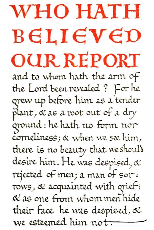
Fig. 91.
[p134]
PAGE OR COLUMN HEADING & INITIAL
Fig. 92 represents the first page of a book or chapter in two columns, beginning with a rather ornate Heading, in which the Initial is made the principal feature, and having coloured Versals and line-finishings throughout the text.
It is more difficult to get a good effect in this way than by means of a marked colour contrast (see p. 144), or variegated colour, and gold (see Note 7).
Note (1).—The lines bounding the text would naturally be indented, or pale (not black as in the block), and ruled from head to foot of the page (see Note (2) on the next figure).
(2) The red ornamental line-finishings (see p. 205) would be more effective if variegated.
(3) The Versals in the text are made about a line high, but are dropped below the line (p. 122).
(4) The Versals in the Heading are made one line high, with one-line spacing—between O and D increased to two lines (partly filled by a flourish from the D), in order to fit the U, O, and D in evenly beside the Initial.
(5) The Initial Q should project slightly up and out—beyond the bounding lines—to mark the top, left corner more strongly (see footnote, p. 211).
(6) All the rubricating on this page is done with the same pen (see pp. 205, 218).
(7) Other Colour Schemes. “Quod fuit ab initio,” the filigree ornament and the V V in burnished gold (or the Q and VV in gold), the rest of the Versals and line-finishings in Red and Blue, or Red and Green, or Red, Blue, and Green (see pp. 181, 185). [p135]
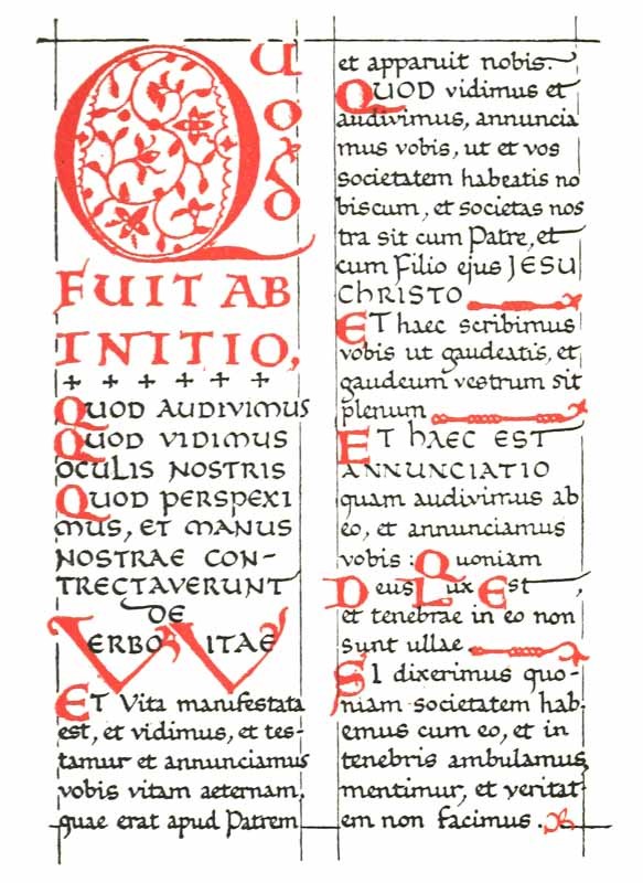
Fig. 92.
[p136]
VERSALS IN COLUMN OR MARGINAL BANDS
Fig. 93 represents two columns of black text, consisting of short verses, &c., which are marked by coloured capitals—forming bands of colour—in the margins.
Note (1).—The coloured capitals in the figure are made rather larger than usual, to enforce the effect of the two lines of red and mark their contrast with the columns of black text. In practice, however, they would be better and more distinct if rather smaller.
(2) The lines bounding the text would naturally be faint, or grooved (p. 343); but, ruled from head to foot of the page, they would be sufficiently apparent to add materially to the general effect of orderly arrangement. (Lines are printed here to show clearly the way the two columns are ruled and to suggest this effect, though the process block necessarily gives a false impression in making them appear too short and too heavy).
(3) Extra width between the columns (and also in the margin) may be allowed for the coloured capitals (compare fig. 92).
(4) Words in simple written capitals are used to mark slight divisions, or changes of sense, in the text.
(5) A stiff Versal of a rather “Roman” type is used, partly because of the number of the capitals (see p. 126).
(6) Other Colour Schemes.—The larger capitals might be in burnished gold, the rest in red (or in red, blue, and green); or all might be in red, blue, and green. [p137]
[p119]
Fig. 84.
Fig. 90.
Fig. 89.
Fig. 92.
Fig. 166.—Pen-capitals from a tenth-century MS. (writing-lines dotted in fig. to show spacing method).
[p126]
[p128]
Fig. 86.
Fig. 165.
Fig. 81.
Fig. 80.
Fig. 85.
[p291]
[p292]
Fig. 46.
[p176]
24 In “Roman” letters the thicks and thins are not necessarily strongly marked, though their pen-forms have often a natural “Gothic” tendency.
[p-xxv]
Fig. 71.—Diagram showing the ruling of a (Recto) page 434 inches × 714 inches as for a manuscript book (allowing five or six words to the Writing-line). There are fifteen Writing-lines, the Line-space being 516 inch.
The proportions of large CAPITALS, shown above, are set by the Line-space (footnote, p. 221).
The Foot margin is 178 inch.
Inner margin 58 inch. Side margin 114 inch. Top margin approximately 78 inch (measured to the top of the writing on the first line—see also fig. 65).
[p294]
Fig. 1.
Fig. 82.
Fig. 83.
Fig. 79. (13th century).
[p253]
Fig. 164.
[p134]
[p185]
[p136]
[p297]
[p138]
Fig. 95.
Fig. 93.
Fig. 87.
[p205]
[p425]
Fig. 88.
[p208]
PAGES WITH COLOURED HEADINGS
25 The mediæval scribes often made the first line of a chapter or book in uniform capitals (excepting the initial letter). The succeeding line generally was smaller, and of a different colour and type—even when a divided word was carried over into it.
Fig. 91.
26 Minium = red-lead, used in early times for “rubrics” and drawings, hence is derived the word “Miniature.”
[p051]
[p142]
[p365]
[p221]
[p181]
[p315]
27 An illuminated Page will allow of a few lines of black text at the foot (an arrangement very common in the elaborate Initial Pages of the fifteenth century), but these should be quite subordinate to the “Illumination.”
[p180]
[p144]
[p122]
[p211]
[p218]
[p343]
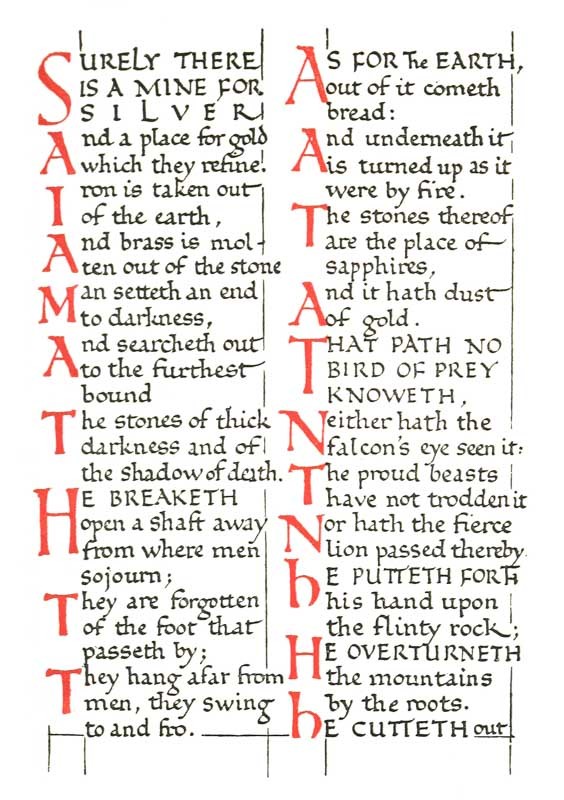
Fig. 93.
[p138]
STANZAS OR VERSES MARKED BY VERSALS
Fig. 94 represents a poem in two verses which are distinguished by interspaces and by coloured capitals—a brief introductory line also being in colour. (It is supposed that the poem occurs in a book—mainly in prose—written in Roman small-letters.)
It is generally best to distinguish the verses of poems by one-line interspaces. When this is done, coloured initials are not so necessary, and their value become chiefly decorative (see 123).
Note (1).—The writing is founded on “Italic” (see Plate XXI.), and (it is supposed that) it would be used here wherever the songs occurred; firstly, to distinguish them from the rest of the text, and secondly, to keep the lines of the poem entire—Italics occupying less room than ordinary, round Small-Letters (see p. 315).
(2) The story opens with the first line, which may in this case be regarded either as a Title or as a prefatory note in red.
(3) The two red capitals are made of a rather “Roman” type to match the Italic (and the small Roman text of the book). The difference in height made between the W and the S is intended to balance the difference in width, and to give them an appearance of equal weight. This may be permitted where there are only a few capitals; where there are many, their heights are generally kept more uniform.
(4) Another Colour Scheme.—W and S would look better in burnished gold. [p139]
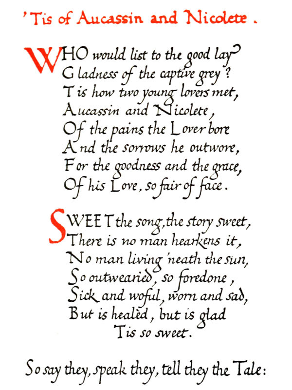
Fig. 94.
[p140]
MUSIC WITH RED STAVES
Fig. 95 is a reproduction, in facsimile, showing quarter of a page of a folio Service Book (probably French, early sixteenth century). The page consists of two columns of ten staves each, and is headed
The red stave is very effective, and it was commonly used in early MSS. and printed books. There appears to be some doubt, however, as to its practical value, and I have been advised that it is not so legible as the black line stave, and also that, in Church Service Books (see p. 345), in order to make an absolutely clear distinction, red should be reserved entirely for the rubrics.
The “plain-song” chant, with its four-line stave, has a simpler and finer appearance than the more modern and elaborate five-lined stave and tailed notes. The latter, however, may yet be treated very effectively.
Note 1.—The mark
(2) Other Colour Schemes.—(a) The title, or (b) the text and the notes, might be in burnished gold (the other parts in either case remaining in red and black). [p141]
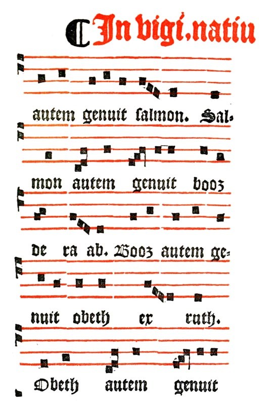
Fig. 95.
[p142]
TAIL-PIECES, COLOPHONS, &C.
Fig. 96 represents a coloured Tail-piece or decorative finish at the end of a book (or chapter).
The Colophon (see p. 128 & figs. 13, 191), generally distinguished from the text by a smaller or different hand, and—especially in early printed books—by colour or other decorative treatment, occurs at the end of a book, where it is the traditional right of the penman and the printer to add a statement or a symbolical device. The Name (of craftsman and assistants), Time, and Place are commonly stated—preferably quite simply—e.g. “This book, written out by me, A.B., in LONDON, was finished on the 31st day of DECEMBER 1900.” Any reasonable matter of interest concerning the text, the materials, methods, lettering, or ornament, and an account of the number of leaves and their size, &c., may be added. But the craftsman, properly and modestly keeping his name off the title-page, is at liberty to exercise his right, marking the end of, and signing his work in any way he chooses—even in a speech or a sentiment—provided the form of the colophon be unobtrusive and its language natural. Printer’s devices or book-marks, consisting of symbols, monograms, &c. (p. 362), were likewise used.
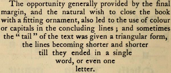

Fig. 96.
[p144]
RUBRICATING: GENERAL REMARKS
Contrast of Red and Black.—The most effective arrangement of red lettering with black text involves a sharp contrast, and, as a rule, the concentration of the red in a line or mass (see figs. 91, 93, and 96, where the red lettering is massed at the head, side, and foot of the black). Too many red capitals scattered through a page lose their effect, and appear as though they were brown-red rather than bright red (see pp. 134, 185). Printed title-pages, &c., may be seen with promiscuous lines of black and red, in which the fine effects obtainable by the use of bright colour is dispersed and lost; while the same, or even a less, amount of red, massed in one or two places in the page, would show to great advantage.
Notes in Red in Margins.—Red lettering, and particularly small red writing, may be used freely in the margins; being much lighter than black, it appears there as a marginal decoration, not interfering with the regular look of the page. Indeed, red may be used more freely, and I think its decorative effect is greater, in the form of rubrics, than in any other simple form of ornament (see Red in Church Service Books (pp. 140, 345) and Red substituted for Italics (p. 315)).
Paragraph and other Marks.—Various symbols, numerals, and marks (such as


Red Lines.—Lines made to divide, or outline, pages (“rules” or “rule borders”) should be sparingly used, and then rather in black than in red (see p. 364). If in red, particularly between lines of writing, these should be “ruled feint” with diluted colour. [p145]
Red for Ornaments.—Red may be used pretty freely with other colours (blue, green, and gold), but by itself more sparingly.
OTHER COLOURS.—The foregoing remarks refer mainly to contrasts of black and red, but apply, to a certain extent, to black with any bright colour (or gold) (see “Other Colour Schemes” given above, and p. 180).
CHAPTER IX LAYING & BURNISHING GOLD Tools & Materials — Laying the Ground — Laying the Gold-Leaf — Burnishing the Gold — Remedying Faults in Gilding — Gold Writing — Other Methods & Recipes for Gilding — Appendix on Gilding (by Graily Hewitt).
TOOLS & MATERIALS
These should be kept together in a convenient box, as it is important that the process should not be interrupted by a search for a missing tool.
Fig. 94.
[p315]
Fig. 95.
[p345]
[p428]
[p302]
Fig. 96.
[p128]
Fig. 13.—Colophon of English MS., dated 1254.
Fig. 191.—MS. written by an English Scribe, in 1269, at Mons, in Hainault—Part of Colophon in large text. (B. M. Egerton, MS. 2569. Reduced five-sixths Scale.)
[p362]
Fig. 91.
Fig. 93.
[p134]
[p185]
[p140]
[p-xxv]
[p364]
[p180]
HARD LEAD PENCIL.
For drawing forms if necessary.
POUNCE.
For preparing surface: “pouncing.”
“SIZE” OR RAISING PREPARATION.
For raising and backing leaf.
SMALL SAUCER.
For mixing size in.
NEEDLE SET IN HANDLE.
For bursting bubbles, &c.
QUILL PEN.
For “laying” the size.
KNIFE.
For trimming size, &c.
GOLD-LEAF.
For gilding.
[p146]SCISSORS.
For cutting gold-leaf.
BURNISHING-SLAB.
For backing the parchment or paper while under pressure.
BREATHING-TUBE.
For damping size.
RUBBING-PAPER.
For pressing leaf on to size.
CHALK OR SOFT LEAD PENCIL.
For marking form on rubbing-paper.
BURNISHER, TOOTH SHAPE.
For (1) pressing down, and (2) burnishing gold-leaf.
FEATHER (Brush, &c.).
For dusting off the pounce.
BRUSH.
For brushing off waste leaf.
(HARD INDIARUBBER.)
(For removing gold from parchment.)
(POWDER GOLD & FINE BRUSH.)
(For “mending” in certain cases.)
LAYING THE GROUND
Drawing the Form.—Elaborate letters or ornaments may be drawn with a hard pencil, which will leave slight indentations in the surface of the page when the marks of the lead have been removed with indiarubber. In the case of free lettering or gold writing, however, the forms should be made directly with the pen (see pp. 148, 164).
Preparing the Surface: Pouncing.—The surface is thoroughly cleaned and prepared with powdered pumice stone, or other suitable “pounce” (see pp. 167, 174). This being rubbed well into the actual part which is to take the size absorbs grease and slightly roughens28 the surface. The surrounding parts are also pounced to prevent the gold-leaf from sticking to them later.
Composition of the Ground or Size. The chief [p147] substance in a “size” or raising preparation is generally some kind of earthy matter, to give it body. Other substances, having toughness and stickiness, are used to bind the earthy matter and prevent its breaking when the page is turned over or bent, and also to make the size adhere to the page and the gold-leaf stick to the size. Yellow or red colouring matter is often added. A preservative, such as oil of cloves—in a minute quantity—may be present: this will permit of the size being kept in a semi-liquid condition, in a closed jar.
The following recipe was given to me by Mr. G. Loumyer:—
- “Chalk (Whiting).
- Oxide of Iron—12 grain.
- Glue (Carpenter’s)—4 grains.
- Gum Arabic—2 grains.
- Water—50 grains.
Melt the gum and the glue together in the water, then add the oxide of iron, and lastly put in enough chalk to make the whole a rather liquid paste. Apply to the parchment, which you have previously well rubbed with whiting, and, when dry, apply the gold-leaf with alcohol.”
Mixing the Size with Water.—A little of the size, taken from the jar (see above), is put in the saucer with a few drops of water to soak for an hour or two. It is then rubbed down with a finger-tip, care being taken to mix it very thoroughly and to avoid making bubbles. The right consistency is judged by experience—it should be thick rather than thin.
It is essential that all the ingredients be present in their right proportions, and the mixture should be stirred every now and then. Otherwise the earthy [p148] matter settles down, and the sticky parts, remaining in solution above, are liable to be used up. What is left in the saucer after use is apt to be deficient in its sticky parts, and it is best thrown away. Take out of the jar only what is required at the time, and mix a fresh lot the next time.
Bubbles, formed in the mixture, may be burst by a needle, or by adding a minute drop of oil of cloves.
Methods of Laying the Size.—The parchment or paper is laid flat on a table; if on a slope, the size would run down and lie unevenly. A quill pen with a finely cut nib and an extra long slit (about 58 inch) is used for laying the size. It is filled pretty full by means of a quill or a brush; if by the latter, special care must be taken to avoid bubbles.
Experiments should be made in various methods.
I. Perhaps the best way of laying the size, so that it may set properly and that the burnish may retain its brilliance, is to put on a thin coat with a pen—in the direct manner in which coloured Versals are made (q.v.)—and afterwards add two or three thin coats, allowing each coat to dry thoroughly. This requires considerable patience and skill, as it takes a long time, and there is a danger, in adding several coats, of spoiling the form by going over the edges.
II. The simplest method for ordinary gold letters is to make them with one extra thick coat29 of size, exactly like coloured Versals—first a natural pen outline, and then the filling in (see fig. 81). This requires some practice to do well, as the thicker size is more difficult to manage than the [p149] colour.30 Very narrow parts—such as the thin strokes—are apt to be deficient in size, and therefore, while they are still wet, the pen—held nearly vertical with the nib in contact with the surface of the size—is moved slowly along it until the stroke has received sufficient size and is properly filled out.
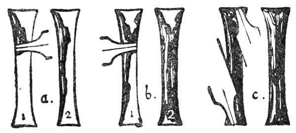
Fig. 97.
III. A method that may be found more convenient for heavy forms, is to hold the pen across the form to be gilded (which has previously been marked on the parchment) with its nib resting on the further outline (a, fig. 97). The nib being moved along that line, by contact with the parchment restrains the size from passing beyond it, while allowing it to flow out freely behind and below (a, 2). The opposite side is similarly treated, and, if the form be narrow, the size as it flows out blends with that already laid (b). The ends of the form are finished in like manner (c). [p150]
The angle of the pen with the parchment is less for a wider form (b, fig. 98).
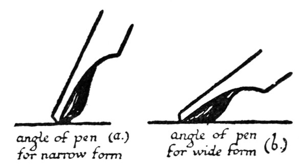
Fig. 98.
As a general rule the size should stand pretty high when wet; it shrinks in drying, and, if it forms too thin a coat, it will neither hold the gold-leaf fast nor burnish well. While the size is still wet it is easy to raise it to any height desired by running more size into the form in the manner described above. It is well, however, not to raise the size too high, as burnished gold too much raised looks out of place on a page and has a heavy and vulgar appearance (p. 184). Very high raising also does not dry so well, and when dry it is more liable to chip.
The work of laying the size should be carried out as quickly as possible. If one part of the form is left any appreciable time before the remaining parts are sized, the first part will begin to settle and dry, and the different layings will not blend or lie evenly. Though the size is thick and awkward to use at first, a little skill will coax it quickly and evenly out of the pen, and it will all blend and dry with an even surface.
When it is sized, put the work away to dry in a [p151] drawer or safe place where it cannot be smudged or get dusty.
Drying the Size.—The average time allowed is twenty-four hours, but it varies with the weather and the temperature; damp weather may make a longer time necessary, and dry weather or heat will shorten the time. The thickness of the raising affects the time very much; a very thin coat will dry in an hour or two, while an extra thick coat may take several days. Size not dry enough is too sticky to burnish; if too dry, it is so absorbent that it sucks up all the moisture which is breathed on it. To ensure the gold-leaf’s sticking thoroughly, it is safer on the whole to gild the size while it is still slightly damp, and delay the burnishing till it is drier.
The time to allow and the right condition of the size for gilding can only be accurately judged by experience.
LAYING THE GOLD-LEAF
Note.—In illuminated MSS., in order to avoid risk of injury to the gold it may be laid last of all (see pp. 170–1). The inexperienced illuminator, however, may find it better to follow the easier method of finishing the gold before applying the colours.
The process of gold-laying must be carried out steadily and quickly; all the necessary tools, &c., should be ready to hand (see p. 145).
The Gold-Leaf.—This is sold in books of twenty-five leaves. The ordinary leaf, about 314 inches square, consisting of gold and alloy, is said to be beaten out to less than 1200,000 inch in thickness. As gold sticks readily to gold, especially when very thin and liable to wrinkle and fold over, or to paper, red [p152] bole or ochre is scattered between the leaves of the ordinary book. This powder will come off on the work and give it an ugly colour, when burnishing, unless it is dusted off very carefully.
It is better to get gold “double” (or “quadruple”) the ordinary thickness, specially prepared for fine work such as illuminating, quite pure, and put up in white books (without bole).
Cutting the Leaf.—With the scissors, which must be quite clean and sharp (or else the gold will stick to them and tear), cut a whole or half leaf of gold, together with the paper leaf on which it lies, out of the book.
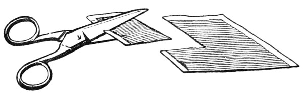
Fig. 99.
The gold is cut on one paper (fig. 99) (not between papers, for then it would stick and tear), and the cut edges of the paper and the gold stick together slightly. If the edge of the gold is anywhere loose and apt to flap about, it and the corresponding paper edge can be nicked together with the scissors (fig. 100). The gold-leaf being lightly held to the paper in this way is easily handled.

Fig. 100.
A piece of gold, about 18 inch larger all round than the form to be gilded, is cut from the leaf in the manner described above (a, b, fig. 100). Except in the case of a very large form, it is not worth trying [p153] to save gold by cutting it out in the same shape. Square, oblong, and triangular shaped pieces are suitable for ordinary use; these are laid in a convenient place—the edge of a book cover will do very well (fig. 101)—ready to be picked up at the right moment.
The burnishing slab (a flat piece of vulcanite, celluloid, or metal) is placed under the page to give it a hard, firm back, which will make the pushing and rubbing of the burnisher effective.
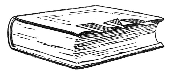
Fig. 101.
Preparing the Size.—If the size has dried rough, it may be lightly scraped with the pen-knife—removing as little as possible of the surface, in which the essential stickiness frequently seems to be concentrated. [p154]
Ordinarily a form should not require trimming, though if its edges have accidental roughnesses, these may be trimmed a little with the pen-knife.
Damping the Size.—The breathing tube is about 12 inch (or less) in diameter, and 6 inches or more in length; it may be made of paper or cane. One end of the tube being lightly held between the lips, the other is moved about over the size, which is gently breathed upon (fig. 102). The breath condensing on the surface of the size, moistens it and renders it sticky. The amount of moistening required depends on the condition of the size.
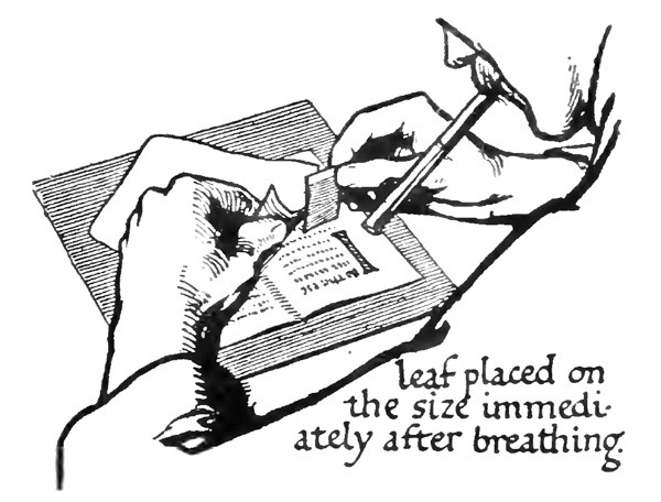
Fig. 102.
Care has to be taken that the breath does not condense in the tube and drop on to the work.
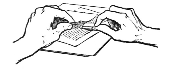
Fig. 103.
Laying the Gold-Leaf.—Immediately that the size has been sufficiently breathed upon, the piece of paper with gold-leaf adhering (held ready in the right [p155] hand) is placed upon it, gold-leaf downwards, care being taken to place it steadily down, and not drag it across the size (fig. 103).
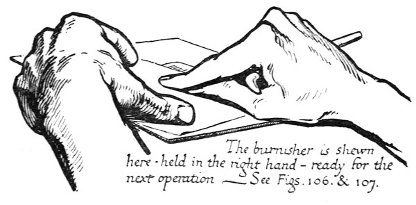
Fig. 104. The burnisher is shown here held in the right hand — ready for the next operation —— See Figs. 106 & 107.
The Rubbing Paper—a convenient piece of thin but tough paper (held ready in the left hand)—is immediately laid above the gold-leaf paper, and is then rubbed over firmly with the finger-tip, in order at once to attach the leaf to the size (fig. 104). It is then quickly rubbed with the soft pencil [p156] or chalk till the raised form underneath is indicated on the surface of the paper (fig. 105).
These two operations may be combined by having a little blue chalk either on the finger-tip or on the upper surface of the rubbing paper.
Round the outline of this form the point of the burnisher31 is worked, pressing the gold-leaf firmly—through both the papers—against the size, in the angle formed by the size and the surface of the parchment (fig. 106).
The fore part of the burnisher is then passed rapidly all over the rubbing paper with a firm pressure (fig. 107).
Fig. 105.
The rubbing paper and the other paper are picked off, and an experienced eye can usually tell if the gold is sticking properly by a peculiar, smooth appearance which it then has.
Several Letters or Forms which are close together may be gilded simultaneously—with one piece of gold-leaf—as if they were one complex form. This saves time, but if too many forms are gilded together, some of them are liable to be less thoroughly and effectually treated.
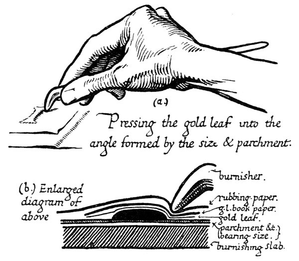
Fig. 106.
Small Scattered Forms (dots, &c.).—For these the gold-leaf may be cut into a sufficient number of little pieces, which are allowed to fall (gold side downwards) on a sheet placed to receive them. [p157] They are picked up separately by means of a needle stuck into their backing-paper.
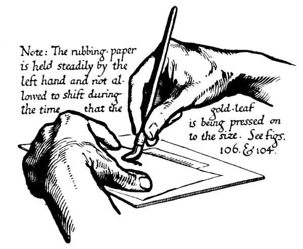
Fig. 107.
Additional Coats of Gold-Leaf.—A second leaf of gold may be laid on immediately on the top of the first; this will ensure richness and facilitate burnishing. Additional leaves may be laid after burnishing, but, unless the first gilding is absolutely clean, there is a risk of the second leaf peeling off when re-burnished. [p158]
BURNISHING THE GOLD
The Burnisher.—A tooth-shaped agate burnisher (fig. 108) is commonly used.
The point is used for pushing the leaf into angles and for burnishing angles (a).
The fore-part for general burnishing (b).
The bend for cross-burnishing and for angles (c).
The side for very gentle and light burnishing (d).
The burnisher is kept scrupulously clean, and to ensure this it is frequently rubbed on a cloth.
Dusting off the Pounce.—The edge of the parchment may be tapped smartly on the desk to shake off the pounce, and a feather or a soft handkerchief may be used, care being taken not to brush the pounce over the gold. [p159]
Brushing off Waste Leaf.—The superfluous gold round the edge of the gilded form may be lightly brushed off with the tip of the brush. This may be done after or before the burnishing—preferably after (see p. 170).
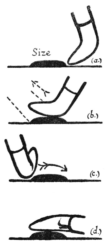
Fig. 108.
Any gold which may have stuck to the surrounding parchment, in spite of the pouncing, may be removed with the knife or with the hard indiarubber point, great care being taken not to touch the gilded size.
Burnishing the Gold.—The gold-leaf may be burnished immediately after laying when the size is very dry, but it is safer to wait for a quarter of an hour—or longer, if the size is at all damp (see Drying, p. 151).
The slab is again put under the work, and the burnishing is begun very gently and cautiously: should the burnisher stick in the very least, it is instantly stopped (or else the gold will be scratched off), examined, and cleaned.
The first strokes of the burnisher are generally carried all over the work, very lightly and with a [p160] circular movement (fig. 109), till the gold begins to feel smooth, and the matt surface gives place to a dull polish.
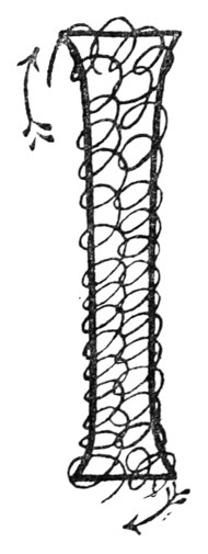
Fig. 109.
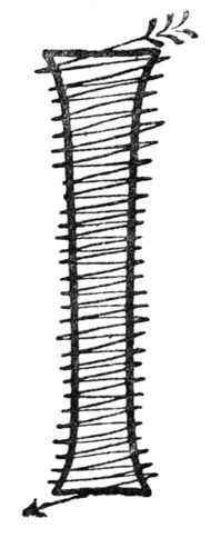
Fig. 110.
As the gold gets smoother a little more pressure is used, and the burnisher is moved in straight lines in every direction across the gold (fig. 110). At this point the gold should have a peculiar and agreeable feeling of smoothness under the burnisher, an unmistakable sign that all is going well.
A rapid light polish with the bend of the burnisher across a gold stem will give a very good finish (c, fig. 108).
Properly burnished gold in a right light is at first as bright as a mirror, and in some lights may look [p161] quite dark by reason of its smoothness. A piece of white paper may be held at such an angle that the white light from it is reflected by the gold; this will show the quality of the burnish, and also show up any brown spots which the leaf may have failed to cover. It is helpful, moreover, during the actual process of burnishing to have a reflecting paper folded and standing beside the work (fig. 111).
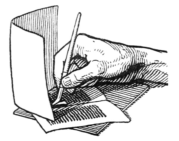
Fig. 111.
At first the size under the burnished gold is not thoroughly hardened, and great care should be taken of it (not to breathe on nor finger the gold in any way, nor allow it to lie about and get dusty). It is best to put it away safely in a drawer for a week or two.
After a week or fortnight, when the size has set a little more, it may be very gently re-burnished, and this may be done again at the end of another [p162] fortnight. This final burnishing, when the size is nearly hard, will give it a very lasting polish. It is well, however, to take every care of burnished gold, and to secure it from risk of damage as soon as may be. Illuminated miniatures were often protected by a piece of silk between the leaves—and this should be done now, in the case of fine work. That a bound volume protects the burnished gold within it is proved by the large number of MSS. in which the gold, laid and burnished 500 years ago, is in perfect and brilliant preservation.
REMEDYING FAULTS IN GILDING
To lay and burnish gold satisfactorily requires considerable experience. Careful practice with a good “size” will overcome the chief difficulties: these, and their probable causes, are here summarised:—
[p148]
[p164]
[p167]
[p174]
28 The surface of horny or greasy parchment may be slightly roughened with a pen-knife till little hairs are raised which will hold the size, care being taken that this roughening does not extend beyond the actual parts which are to be covered with size. (Oxgall: see footnote, p. 175.)
29 As this is usually allowed to dry for twenty-four hours, make sure, before laying the size, that you will be able to lay the gold-leaf on it at or near the same time on the next day.
Fig. 81.
30 Should a drop fall on the page it can be removed quickly with the knife, but it is safer to allow it to dry and then to pick it off carefully. Size which has flowed beyond the bounds of the form may be trimmed away when it has set.
Fig. 97.
Fig. 98.
[p184]
[p170]
[p171]
[p145]
Fig. 99.
Fig. 100.
Fig. 101.
Fig. 102.
Fig. 103.
Fig. 106.
Fig. 107.
Fig. 104. The burnisher is shown here held in the right hand — ready for the next operation —— See Figs. 106 & 107.
Fig. 105.
31 A finer metal or ivory point may also be used.
Fig. 108.
[p151]
Fig. 109.
Fig. 110.
Fig. 111.